Toggle Button
Toggle Buttons add checkbox style functionality to the standard button. This allows for the creation of buttons which can have a selected state and an unselected state. A Toggle Button “toggles” from selected to unselected— on to off (and vice versa , off to on)—each time a user clicks on it. It may also be toggled via AS.
A few possible use cases for the Toggle Button component might be:
- Menu buttons
- Enable/disable bloom visual effect
- Mute/unmute audio
- High quality lighting on/off
- Auto save on/off
- In-game console controls that require an on/off state
- Mini-game buttons that require an on/off state
The Toggle Button uses the same AS class as the standard button. The only difference is that the toggle property has been set to “true.” Since the AS class inherently supports Toggle Buttons, it is up to the user to provide the additional state frames on the timeline if the user chose to use the standard button component over the provided Toggle Button component. However, it is recommended that the user makes use of the prebuilt Toggle Button to save time. The same is true for Animated Button and Animated Toggle Button described in sections 4 and 5.
In order for the toggle button to function properly, make sure the toggle field in the Component Inspector Parameters tab in CS4 (Parameters tab in CS3) is set to “true.” By setting the toggle property of any CLIK Button component to you force it to behave like a Toggle Button.
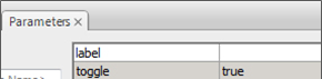
Figure 6: The toggle parameter set to 'true'.