Toggle Button States
In addition to the standard Button states—up, over, down, and disabled—a Toggle Button also includes the following specialized states:
- selected_up
- selected_over
- selected_down
- selected_disabled
These four specialized states are used to represent a Toggle Button which has been toggled “on” or selected, whereas the original Button states of up, over, down, and disabled are used in a Toggle Button to represent a button which has been toggled “off” or unselected.
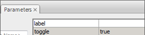
Figure 7: The Toggle Button timeline with states clearly labeled.
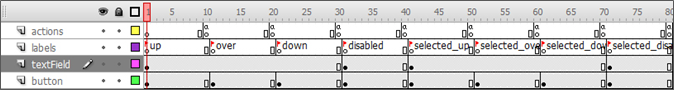
Figure 8: The new Toggle Button states' graphical wireframe representations side by side.
Selected_up is the normal “at rest” state of an unfocused Toggle Button that has been toggled “on” or “selected” by the user. This state typically includes a graphical indicator of some kind to indicate the button is “on” such as a thick border or color change.
Occurs: When a user clicks on a Toggle Button that is currently “off” or “unselected,” the button will become “selected” or “on” and go to the selected_over state. Also, once the user moves focus away from this button by clicking on another component, or using the arrow keys or game controller, it will change to the selected_up state.
Usage: Represents an unfocused Toggle Button set to “selected” or “on.”
Selected_over occurs when the user moves the mouse cursor over a toggled button or uses the arrow keys or game controller to move to an unfocused Toggle Button that is “on” or “selected.” Moving the mouse away or using the arrow keys or game controller to move away from the button will return the button to the selected_up state.
Occurs: When the user moves the mouse cursor over a Toggle Button set to “on” or “selected” or when the user focuses on the button using the arrow keys or game controller.
Usage: Represents a focused Toggle Button set to “on” or “selected.”
Selected_down occurs when the user presses on a Toggle Button set to “on” or “selected” via a left mouse click, the (Enter) key, or the appropriate button on a game controller. The button will remain in the selected_down state for as long as the mouse button, (Enter) key, or game controller button is pressed. The act of pressing a toggle button switches its selected state, and therefore the button will return to the over state, which represents “unselected” or “off,” once released. The converse is true for the down state, where the button moves to the selected_over state.
Similar to the standard Button, pressing on a selected Toggle Button transfers focus to it. Its default state will be set to the selected_over state if the Toggle Button is “on,” or the over state if the button is “off.” If the user moves the mouse cursor away from the button component while the mouse button is still depressed and then releases the mouse button, then the button component will revert to the selected_over state if “on,” or the over state if “off.”
Occurs: When the user presses the left mouse button while the mouse cursor is over the Toggle Button, or presses the (Enter) key or game controller button while the Toggle Button is focused.
Usage: Represents a focused Toggle Button set to “on” that is being clicked.
The selected_disabled state, much like the standard Button disabled state, represents the state of a Toggle Button set to “on” that has been disabled. A disabled Toggle Button cannot be pressed or focused, and does not react to mouse over events, keyboard events, or game controller events. A Toggle Button may be disabled via the Parameters tab, or via AS using the following code:
buttonInstanceName.disabled = true;
Occurs: Set via ActionScript or Parameters tab.
Usage: Represents a Toggle Button that is selected or set to “on” that has been disabled and is unusable.