This topic contains information to help you more effectively use the Arch & Design material for mental ray.
Final Gather Performance
The Final Gather algorithm in the current version of mental ray is vastly improved from earlier versions, especially in its adaptiveness. This means you can often use much lower ray counts and much lower densities than previously.
In many cases, you can render still images with such extreme settings as 50 rays and a density of 0.1. If this causes “oversmoothing” artifacts, use the built-in ambient occlusion to solve those problems.
When you use Final Gather together with GI (photons), make sure the photon solution is fairly smooth by first rendering with Final Gather disabled. If the photon solution is noisy, increase the photon search radius until it “calms down,” and then enable Final Gather.
Quick Guide to Some Common Materials
Following are some quick rules of thumb for creating various materials. Each assumes the basic default settings as a starting point.
General Rules of Thumb for Glossy Wood, Flooring, and So On
These are the kind of “hybrid” materials you might require for architectural renderings; varnished wood, linoleum, and so on.
For these materials, set BRDF to Custom Reflectivity Function; that is, you'll define a custom BRDF curve. Start out with 0-degree reflectivity of 0.2, 90 degree reflectivity of 1.0, and apply a suitable texture map to the Diffuse Color. Set Reflectivity between 0.6 and 1.0.
How glossy is the material? Are reflections clear or blurry? Are they strong or weak?
- For clear, fairly strong reflections, keep Reflection Glossiness at 1.0.
- For slightly blurry but strong reflections, set a lower Reflection Glossiness value. If performance becomes an issue, try turning on Fast (Interpolate).
- For slightly blurry but also very weak reflections, you can “cheat” by applying a lower Reflection Glossiness value for broader highlights while setting Reflection Glossy Samples to 0. This shoots only one mirror ray for reflections, but if the reflectiosn are weak, often the viewer can not tell.
- For moderately blurry surfaces, set an even lower Reflection Glossiness value and maybe increase the Reflection Glossy Samples value. Again, for improved performance, turn on Fast (Interpolate).
- For extremely blurry surfaces or surfaces with very weak reflections, try turning on Highlights+FG Only.
A typical wooden floor could use a Reflection Glossiness of 0.5, Reflection Glossy Samples of 16, Reflectivity of 0.75, a nice wood texture for Diffuse Color, and perhaps a slight bump map. If bumpiness should appear only in the varnish layer, turn on Special Purpose Maps rollout  Do Not Apply Bumps To The Diffuse Shading.
Linoleum flooring can use the same settings but with a different texture and bump map, and probably with slightly lower Reflectivity and Reflection Glossiness values.
Ceramics
Ceramic materials are glazed; that is, they're covered by a thin layer of transparent material. They follow rules similar to the general materials mentioned above, but set the BRDF method to By IOR (Fresnel Reflections), set IOR to about 1.4, and Reflectivity to 1.0.
Set the Diffuse Color to a suitable texture or color, such as white for white bathroom tiles.
Stone Materials
A stone object usually has a fairly matte finish, or has reflections that are so blurry they are nearly diffuse. You can simulate the “powdery” character of stone with the Diffuse Roughness parameter: Try 0.5 as a starting point. Porous stone or brick would have a higher value.
Stone typically has a very low Reflection Glossiness (lower than 0.25) and you can most likely use Highlights+FG Only to good effect for very good performance. Use a nice stone texture for Diffuse Color, some kind of bump map, and perhaps a map that varies the Reflection Glossiness value.
The Reflectivity would be around 0.5–0.6 with By IOR (Fresnel Reflections) off, 0-degree reflectivity at 0.2, and 90-degree reflectivity at 1.0.
Glass
Glass is a dielectric material, so By IOR (Fresnel Reflections) should definitely be on. The IOR of standard glass is 1.5. Set the Diffuse Level to 0.0, Reflectivity to 1.0, and Transparency to 1.0. This is enough to create basic, completely clear refractive glass.
If this glass is for a window pane, turn on Thin-Walled. If this is a solid glass block, turn off Thin-walled and consider whether caustics are necessary: Set Refractive Caustics accordingly.
If the glass is frosted, set Refraction Glossiness to a suitable value. Tune the Refraction Samples for good quality, or turn on Fast (Interpolate) for faster performance.
Colored Glass
For clear glass, use the tips in the preceding section. Colored glass, however, is a different story.
Many shaders set the transparency at the surface of the glass. And indeed this is what happens if one simply sets a Refractive Color to some value, such as blue. For glass with Thin-Walled turned on, this works perfectly. But for solid glass objects this is not an accurate representation of reality.
The scene in following illustration contains two glass blocks of different sizes, a sphere with a spherical hole inside it, and a glass horse.
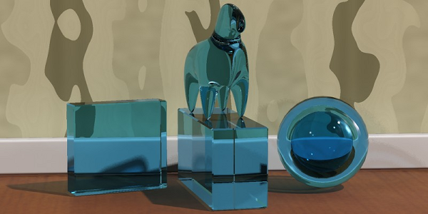

Above: Incorrect shading because the color of the solid glass was modeled solely with a surface refraction color
Below: Correct shading. The glass uses Refraction  Max Distance and a Max Distance color.
The problems are evident:
- The two glass blocks are of different thicknesses, yet they are exactly the same level of blue.
- The inner sphere is darker than the outer one, instead of lighter.
Why does this happen?
Consider a light ray that enters a glass object. If the color is located at the surface, the ray is colored somewhat as it enters the object, retains this color through the object, and receives a second coloration (attenuation) when it exits the object:
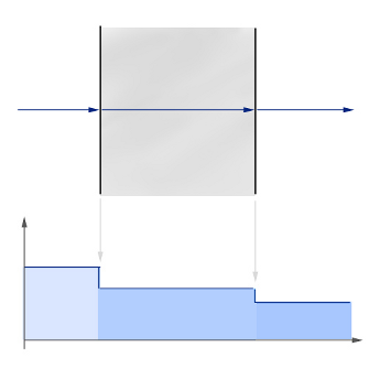
Diagram for glass with color changes at the surface
In the above illustration, the ray enters from the left, and at the entry surface it drops in level and gets slightly darker (the graph illustrates the level schematically). It retains this color throughout its travel through the medium and then drops in level again at the exit surface.
For simple glass objects, this is quite sufficient. For any glass using Thin-Walled it is by definition the correct thing to do, but for any complex solid it is not. It is especially wrong for negative spaces inside the glass (like the sphere in our example), because the light rays have to travel through four surfaces instead of two, getting two extra steps of attenuation at the surface.
In real colored glass, light travels through the medium and is attenuated as it goes. In the Arch & Design material, this is accomplished by turning on Advanced Rendering Options  Refraction
  Max Distance, setting the Color At Max Distance, and setting the Refraction Color to white.
The result is clearly much more satisfactory: The thick glass block is a deeper blue than the thin one, and the hollow sphere now looks correct. In diagram form, the process looks as follows:
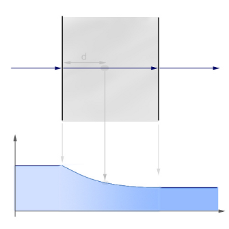
d=Max Distance where attenuation is Color at Max Distance
The ray enters the medium and is attenuated throughout its travel. The strength of the attenuation is such that precisely the Max Distance attenuation (d in the figure) matches that of Color At Max Distance. In other words, at this depth the attenuation is the same as was received immediately at the surface with the previous scene. The falloff is exponential, so at double the Max Distance value the effect is that of Color At Max Distance squared, and so on.
There is one minor tradeoff: To render the shadows of a material correctly using this method, either you must use caustics, or make sure that mental ray is rendering shadows in Segments mode (see Shadows & Displacement Rollout (mental ray Renderer)).
Using caustics naturally gives the most correct-looking shadows (the above image was rendered without caustics), but requires that the scene have caustic photons enabled and contain a physical light source that shoots caustic photons.
On the other hand, the mental ray Segments shadows have a slightly lower performance than the more widely used Simple shadow mode. But if it is not used, the shadow intensity will not take the attenuation through the media into account properly. However, the image might still look pleasing.
Water and Liquids
Water, like glass, is a dielectric material with an IOR of 1.33. Hence, the same principles as for glass (above) apply to bodies of water, which truly need to refract their environment. An example is water running from a tap. Colored liquids use the same principles as colored glass.
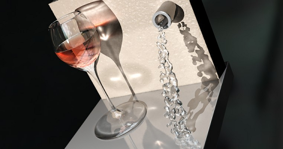
Water into wine
To create a liquid in a container, as in the preceding image, it is important to understand how the Arch & Design material handles refraction through multiple surfaces, compared to the real-world behavior of light in such circumstances.
What is important for refraction is the transition from one medium to a medium with a different IOR. Such a transition is known as an interface.
For lemonade in a glass, imagine a ray of light travelling through the air (IOR=1.0). When it enters the glass, it is refracted by the IOR of the glass (1.5). The ray then leaves the glass and enters the liquid; that is, it passes through an interface from a medium of IOR 1.5 to another medium of IOR 1.33.
One way to model this in computer graphics is to make the glass one separate closed surface, with the normals pointing outward from the surface of the glass and an IOR of 1.5, and a second, closed surface for the liquid, with the normals pointing outward and an IOR of 1.33, leaving a small air gap between the container and the liquid.
This approach works, but can cause a problem: When light goes from a higher IOR to a lower there is a chance of an effect known as total internal reflection (TIR). This is the effect you see when diving into a swimming pool and then looking up: You can see the objects above the surface only in a small circle straight above. Anything below a certain angle shows only a reflection of the pool and things below the surface. The larger the difference in the IOR of the two media, the greater the chance of TIR.
So in our example, as the ray goes from glass (IOR=1.5) to air, there is a large chance of TIR. But in reality the ray would move from a medium of IOR=1.5 to one of IOR=1.33, which is a much smaller step with a much smaller chance of TIR. This looks different:
 .
. Left: Correct refraction
Right: The “air gap” method
The result on the left is the correct one, but how it is obtained?
The solution is to rethink the modeling, and not to think in terms of media, but in terms of interfaces. In our example, we have three different interfaces, where we can consider the IOR as the ratio between the IORs of the outside and inside media:
- Air-glass interface (IOR=1.5/1.0=1.5)
- Air-liquid interface (IOR=1.33/1.0=1.33)
- Glass-liquid interface (IOR=1.33/1.5=0.8)
In the most common case of an interface with air, the IOR to use is the IOR of the media (because the IOR of air is 1.0), whereas in an interface between two different media, the situation is different.
To correctly model this scenario, then, we need three surfaces, each with a different Arch & Design material applied:
- The air-glass surface (blue in the diagram that follows), with normals pointing out of the glass, covering the area where air directly touches the glass, having an IOR of 1.5
- The air-liquid surface (green in the diagram), with normals pointing out of the liquid, covering the area where air directly touches the liquid, having an IOR of 1.33
- The glass-liquid surface (red in the diagram), with normals pointing out of the liquid, covering the area where the glass touches the liquid, having an IOR of 0.8

The three interfaces for a liquid in a glass
By setting suitable Max Distance and Color At Max Distance values for the two liquid materials (to get a colored liquid), we obtain the glass on the left in the preceding rendered image.
Ocean and Water Surfaces
A water surface is a slightly different matter than a visibly transparent liquid.
The ocean isn’t blue; it is reflective. Not much of the light that penetrates the surface of the ocean gets anywhere of interest. A small amount of light is scattered back up again, doing a bit of literal subsurface scattering.
To make an ocean surface with the Arch & Design material, follow these steps:
- Set Diffuse Level to 0.0, Reflectivity to 1.0, and Transparency to 0.0. That's right: No refraction is necessary.
- Set IOR to 1.33 and turn on By IOR (Fresnel Reflections). Apply an interesting wobbly shader to Bump (Ocean (lume) works well here) and your ocean is basically done.
This ocean has reflections guided only by the IOR. But this might work fine; try it. Just make sure there is something there for it to reflect. Add a sky map, objects, or a just a blue gradient background. There must be something to reflect, or the water will be completely black.
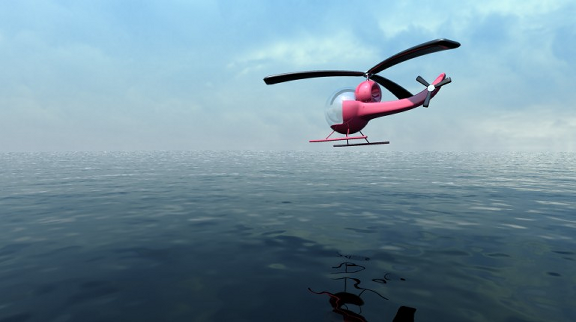
The ocean isn’t blue; the sky is.
For a more tropical look, try setting Diffuse Color to a slightly blue-green color, set the Diffuse Level to a fairly low number such as 0.1, and turn on Do Not Apply Bumps To The Diffuse Shading.
Now you have a base color in the water that emulates the small amount of scattering that occurs in the top level of the ocean.
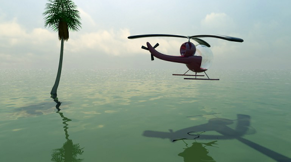
Enjoy the tropics.
Metal
Metals are reflective, which means they need something to reflect. The best-looking metals come from having a true HDRI environment, either from a spherically mapped HDRI photo, or something like the mental ray physical sky.
To create classic chrome, turn off By IOR (Fresnel Reflections), set Reflectivity to 1.0, 0-degree reflectivity to 0.9, and 90-degree reflectivity to 1.0. Set the Diffuse Color to white, and turn on Metal Reflections.
This creates an almost completely reflective material. Tweak the Reflection Glossiness parameter for various levels of blurry reflections. Also consider using the Round Corners effect, which tends to work very well with metallic objects.
Metals also influence the color of their reflections. Because you turned on Metal Reflections, this is already happening: Try setting the Diffuse Color to a golden color to create gold.
Try various levels of Reflection Glossiness (with the help of Fast (Interpolate) for performance, when necessary).
You can also change the Reflectivity value. This has a slightly different meaning when Metal Material is on; it blends between the reflections (colored by the Diffuse Color) and normal diffuse shading. This allows a blend between the glossy reflections and the diffuse shading, both driven by the same color. For example, an aluminum material would need a bit of diffuse blended in, whereas chrome would not.
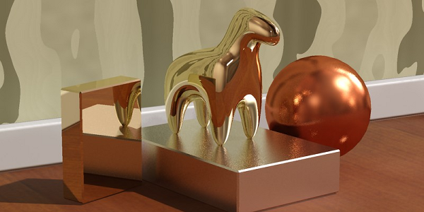
Gold, silver, and copper
Brushed Metal
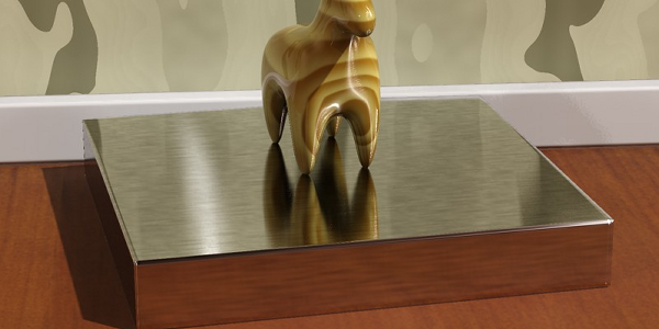
Brushed metal is an interesting special case. In some cases, creating a brushed metal requires only turning down the Reflection Glossiness to a level where you obtain a very blurred reflection. This is sufficient when the brushing direction is random or the brushes are too small to be visible even as an aggregate effect.
For materials that have a clear brushing direction or where the actual brush strokes are visible, creating a convincing look is slightly more involved.
The tiny grooves in a brushed metal surface all work together to cause anisotropic reflections. This can be illustrated by the following illustration, which simulates the brush grooves by modeling many tiny adjacent cylinders, shaded with a simple Phong shader:
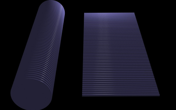
Many small adjacent cylinders
As you can see, the specular highlights in the cylinders work together to create an aggregate effect which is the anisotropic highlight.
Also note that the highlight isn’t continuous: It is actually broken up into small, adjacent segments. So the primary visual cues that a material is brushed metal are:
- Anisotropic highlights that stretch out in a direction perpendicular to the brushing direction
- A discontinuous highlight with breaks in the brushing direction
Many attempts to simulate brushed metals have looked only at the first effect: the anisotropy. Another common mistake is to think that the highlight stretches in the brushing direction. Neither is true.
Hence, to portray brushed metals, it is necessary to simulate these two visual cues. The first is simple: Use Anisotropy and Anisotropy Rotation to make anisotropic highlights. The second can be done in several ways:
- With a bump map
- With a map that varies the Anisotropy or Reflection Glossiness values
- With a map that varies the Reflection Color
Each has advantages and disadvantages, but the one we suggest here is the last one. The reason for choosing this method is that it works well with interpolation.
- Create a map for the brush streaks. The possible ways to do this include painting a map in a paint program, or using a Noise map that has been stretched heavily in one direction. The map should vary between middle-gray and white.
- Apply this map to the Reflection Color in a scale suitable for the brushing.
- Set Diffuse Color to white (or the color of the metal), but set Diffuse Level to 0.0 (or a small value).
- Make sure Metal Material is on.
- Set Reflection Glossiness to 0.75.
- Set Anisotropy to 0.1 or a similar value. Use Anisotropy Rotation to align the highlight properly with the map. If necessary, use Anisotropy Channel to base it on the same texture space as the map.
Brushed metal