
This section contains a more advanced sample of using the layering shaders for skin rendering. It is more high-level in that it does not list the individual steps with little .mi snippets, but simply describes them. This is really just the same "operations" done in the first tutorial page applied in a different context.
In general, these shaders supercede and replace most of what the old misss_ shaders did. There are several reasons for this:
Since the misss_* shaders and the layering shaders are so different, there is really no point to do a one-to-one comparison between them. The misss_* shaders were written for a different era in what computational complexity was feasible, and what expectations of shaders were at the time. They have served us incredibly well over the years, but they are now getting old and tired and wants a younger generation to step in.
Some of the lessons and thoughts from old skin shading tutorials for the misss_* shaders can still be used, but some differences apply, which will be noted below.
We start from scratch with a simple head. Note, that this tutorial will use a fairly low-poly head model, and mostly flat colors, and apart from some procedural textures, no texture maps. Needless to say, a true production would apply texturing to almost all the parameters listed below for a truly photoreal result. But considering how far one gets with simply flat colors, this is quite encouraging.
The head is lit by two portal lights used as light cards, i.e. fairly soft lighting.
The following image is the result of just putting a simple default mila_diffuse layer into a mila_layers plugged into a mila_material_std. The image we get is this:

Now, skin is bumpy, and the bumps is an extremely important part of the overall appearance of skin. You really can't render skin that doesn't have bumps. So the first thing we do is apply a bump map, by simply attaching a simple procedural bump map to the "bump" input of the diffuse layer we just created.
The bumps are a bit larger than in real life to more clearly show off the effects discussed in this tutorial.
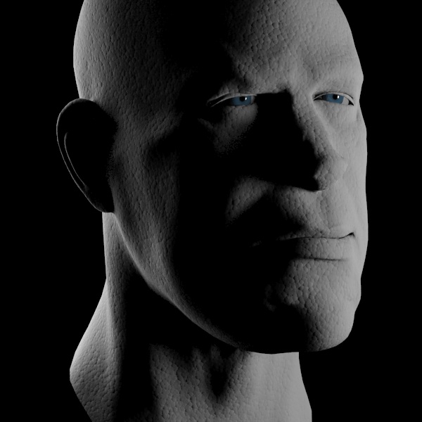
The image we see above is bumpy, but looks more like stone, because the bumps are quite harsh. In spite of the soft lighting, the dark in the shadows between the bump is quite strong, whereas in real skin light would bleed around a bit under the skin.
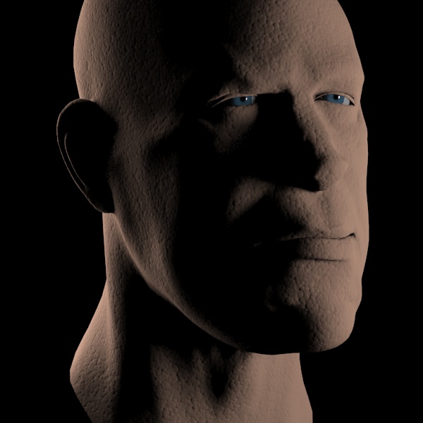
If we give the skin a nice skin color, we get the following result:
Now lets turn our eyes towards the Scatter component shaders. We add a mila_scatter, which we put on a layer under the diffuse, and set the shaders R, G and B scatter radii to the same value of 30mm both for front and back scattering.
We also set the same bump map as we used on the diffuse layer, and (for now) turn the diffuse layer off completely, to only look at the scattering. This is the rendering we get with a 30mm scattering for all colors:
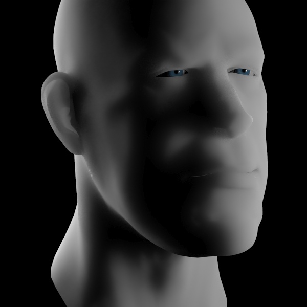
Notice above how there was only scattering, and the bump map we applied had no effect? That is correct; sub-surface scattering goes on below the surface, and bump is applied on the surface.
This scattering looks remarkably like what you could get with the old misss_* shaders, except there was no tricky setup with lightmaps etc. However, it is actually slightly different in it's behavior already here; the falloff is exponential, rather than following a hardcoded power- function like the old shaders did. This difference is quite subtle, but is there.
This means that while the values given as a scatter radius in the old misss_* shaders truly was a radius and scattering only occured within this radius, this is not true for these shaders.
An exponential falloff never ends, it only gets smaller. Since there is no "end", the radius you set is not the radius where scattering "stops", but it is actually the radius for where the scattering weight has been reduced to 10%.
But since we don't want the computer to sample the entire scene for potential contributions of light to scatter, there is a limit to how large radius it actually performs samples within, and that is the sampling_radius_mult parameter. It uses the largest radius given in any of the other radius parameters, and actually considers (samples) light within that radius times it's value. In our case, all radii are 30mm, and with the sampling_radius_mult at 2 (the default), it would sample within a radius of 60mm.
Generally, the default of 2 is plenty... since every radius distance means a drop by to 10%, the radius times two means 1%, radius times 3 means 0.1%... only increase this parameter if you really have such strong light hitting your object that less than 1% of the light would actually contribute to the final image. Increasing this parameter needlessly just increases render time and can add more noise.
Though demonstrative of the scatter effect, scattering only a single distance for all colors is not as useful as per color band. Generally, light is absorbed in the material, and the shorter the wavelength (the bluer the light), the quicker it is absorbed.
We try to set the red scatter radius to 20, the green to 10 and the blue to 5, and we get:
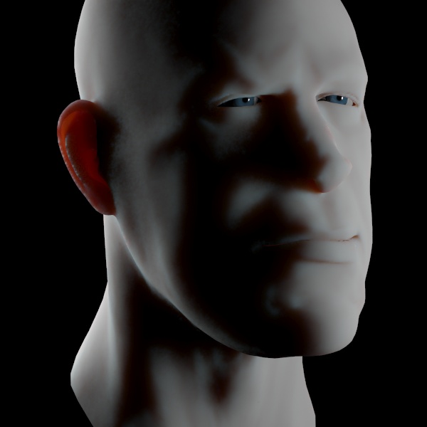
The image above steps us in the direction of the look of skin!
With larger radii values to see the effect more clearly:
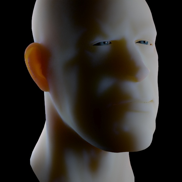
The image above clearly shows the different color components scattering different distances. Notice how also the light through the ear goes through various shades from yellowish to orange to red depending on thickness. All these effects come automatically with the new shaders. In the old misss_* shaders, scattering through the ears was only red because one made it red with the scatter color. The scatter color here is still white!
In the past, multi-layered scattering with epidermal and subdermal scattering layers was necessary to get an effect even close to skin. And while having separate scattering for different layers of skin can still be useful, we get really far with just one!
We will tweak the values for the scattering to something reasonable such as 30mm for red, 10mm for green and 5mm for blue. This gives the following result, which we will be using from now on:
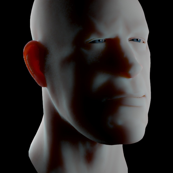
The above looks like a reasonable scattering spread, but the color is too white. But this is actually an important feature!
One issue with the misss_* shaders was that each layer had it's distinct color, which made it difficult to aim for a given "final" color, and changing the balance between the layers threw the color off.
This is much easier with the new shaders, because the sum of the R/G/B scatterings still tend to the overall scatter color. So walking far enough away from the object so that no scattering is seen, it will have exactly the scattering color, which is white in the above case. This will be really useful when texturing later.
But we want something a bit more skin colored than white, though, so we change both the front and back scattering colors to the same skin color we used for the diffuse layer. We get this result:
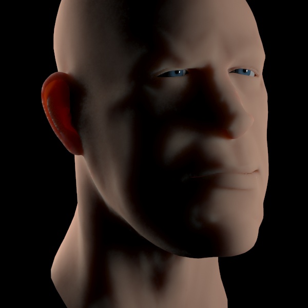
One can now notice how the above color has the same overall color tone as the diffuse render. This is great for texturing. Now, remember that scattering is about blurring light so it may still not be a good idea to map a texture to the scattered parameter with lots of fine detail in it. One common error is to map textures onto the scattering component that contains painted-in shadows in crevices; this is wrong, because that makes it impossible for light to scatter into these crevices, which is precisely what sub surface scattering is supposed to do!
Now, since these overall colors tones are so similar, we can trivially balance between the amount of scattering and amount of diffuse simply by playing with the weight of the layers!
So we turn our diffuse layer back on, and set it's weight to 0.5, and we get this:
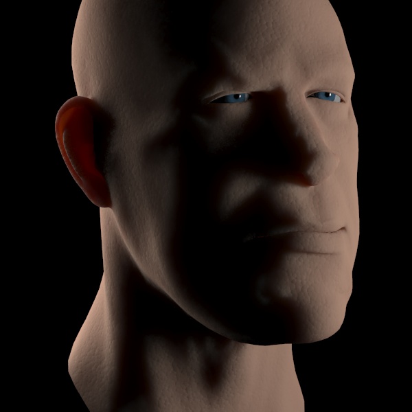
Above shows the 50/50 mix of the diffuse and the scattering. As we can see, the overall color is pretty much the same, only the apparent softness of the surface has changed. This makes look development a lot easier than with the old shaders!
Now we want to move into reflections, but not much interesting will happen if there is nothing to reflection. So we add an environment map to our scene, and turn on Final Gathering to light up the objects from said environment.
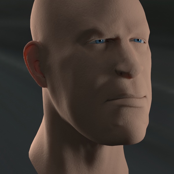
The above is looking quite nice but like an extremely "dry" face. Real skin has oily top layers and other things causing it to reflect light nicely.
So we simply throw in a mila_reflection layer on top and give it the same bump as the other layers. The result will be this:
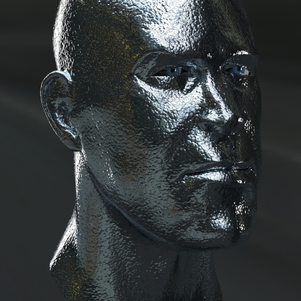
Oops, we forgot that reflectivity for pretty much any kind of coating follows a fresnel curve. But this clearly illustrates the energy conservation rules of the layering; when adding 100% of reflection on top, nothing else gets through. And due to the intelligent handling of the layers, this actually rendered faster because no sub surface scattering calculations were done at all for this render!
We change the angular_mode of the reflection layer to 1 and sets the fresnel_ior to 1.4 and we get the following result:
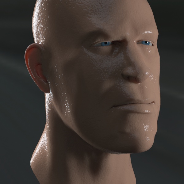
Wow, this guy is either really sweaty or just got out of the bathtub.
Of course, the above render was with the default full specular reflection layer. But skin has very blurry reflections. We turn down the glossiness value of the reflection layer to 0.42 and we get this result:
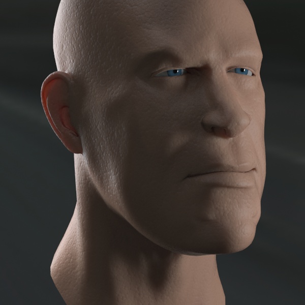
The above shows a much more realistic glossy covering for skin.
Now in general, skin has various types of glossiness. There is underlying grease, there is sweat on top, and so on. Since the layering shaders really give us no penalty for just piling on layers, we will do just that, and add a second glossy layer.
We add another mila_reflection on top, set it's glossiness to 0.6, set the layers angle_mode to 1, it's fresnel_ior to 1.5 and we get this render:
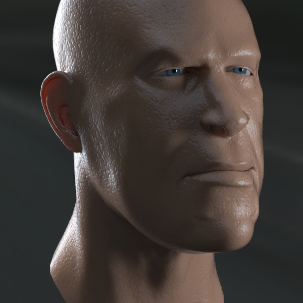
Admittedly, the above looks a little artificial because the new glossy layer is completely uniform. The real trick in realism is to break up reflections with textures, modifying the glossiness across the surface, etc. But for a two completely uniform glossy layers, it looks pretty good. The guy may need to wash off some oil, but it looks quite reasonable!
But why stop there? This is only a few layers so far.
Real skin can be covered with all sorts of stuff. Again, the automatic layering logic helps us a lot here. For example, we can try to add something akin to makeup by simply adding another colored diffuse layer on top.
Just slap on a green mila_diffuse, and give the layer the same bump map as the other layers, and some texture as a mask, and we get something like this:
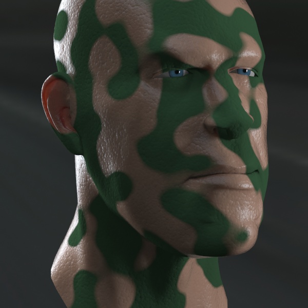
When doing effects like this is it important to think how it works in the real world. Makeup actually covers the skin. So rather than painting it into the diffuse color of the skin, why not make it as a true cover?
Of course, this pattern leads us to think more about the grease-paint used by soldiers, so lets add yet another fresnel-weighed glossy reflection layer on top of the paint, using the same bump and mask as before.... we get this:
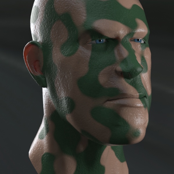
Above is quite passable warpaint...
But notice how we start to repeat masks and bump maps all over the place? This is where the layering shaders ability to cascade into eachother begins to shine.
A better setup for the exact same render as above would be to group together the layers that made skin into one mila_layers and the layers that make the warpaint into another mila_layers, and then layer the two in a third mila_layers, i.e. roughly:
  Reflection __
               \
  Diffuse _____"warpaint" layers ___
                                     \
                                 "overall" layers ---> material ---> mental ray material
  Reflection  ____                   /
                  \                 /
  Reflection  ___ "skin" layers __/
                  //
  Diffuse _______//
                 /
  Scattering ___/
This setup allows us to apply the bump in fewer places. We can apply the bump in the "overall" layers and apply it to the entire "skin" and "warpaint" layers in one operation. Also, the mask we used to mask out the "warpaint" needs to be only applied once to the entire "warpaint" layer instead of the individual "diffuse" and "reflection" components.
This logical divide gets extra powerful when we want to add yet another material to the mix.
Since we know this is a good idea, we create yet another mila_layers called "dirt" and plug this into the top of our "overall" layers, and give it some texture as a weight. Inside this layers node we add a mila_diffuse and set it to gray. We get this:
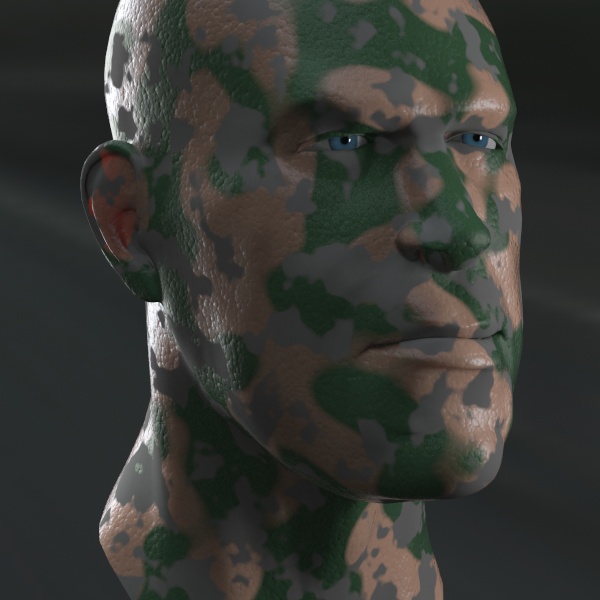
Now we have gray dirt. Notice how we intentionally did not put a bump map on the dirt layer, allowing us to make it feel "flat", as if it was covering over the pores in the skin? Also note how nicely the dirt is blocking the scattering coming through the ear.
If we now want to add a bump to the "dirt", we have already understood it is smarter to apply this to the "dirt" layer in the "overall" layers, than directly on the diffuse node. So we add some (different) bump and then we change the color to brown, and we get this nice render:
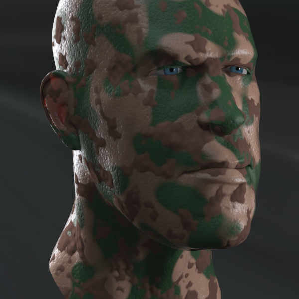
Nice dry mud render above. The wobbly bump makes it feel like thick mud cakes on the face.
Now the benefit of the nested materials become evident when we decide to turn the dry mud wet and change it's color to try to simulate blood. We simply change the diffuse color to red, and apply a mila_reflection on top of the diffuse (inside the "dirt" layers) and set it's angle_mode to 1 and fresnel_ior to 1.4, and we get:
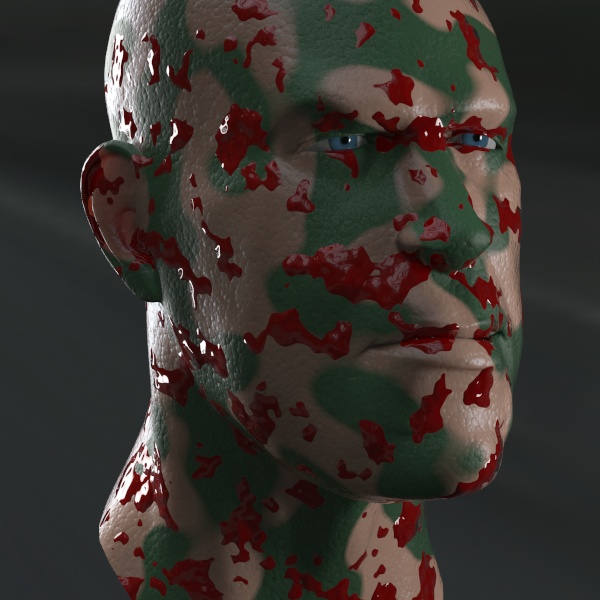
Voilà! By already placing the material into a nested mila_layers we could easily change the properties and add another "sublayer" without having to duplicate bump maps and masks. We directly turned the mud to blood in a very simple way.
Of course, this blood looks a little thick, we can simply turn down the weight of the "dirt" layer.... and get this:
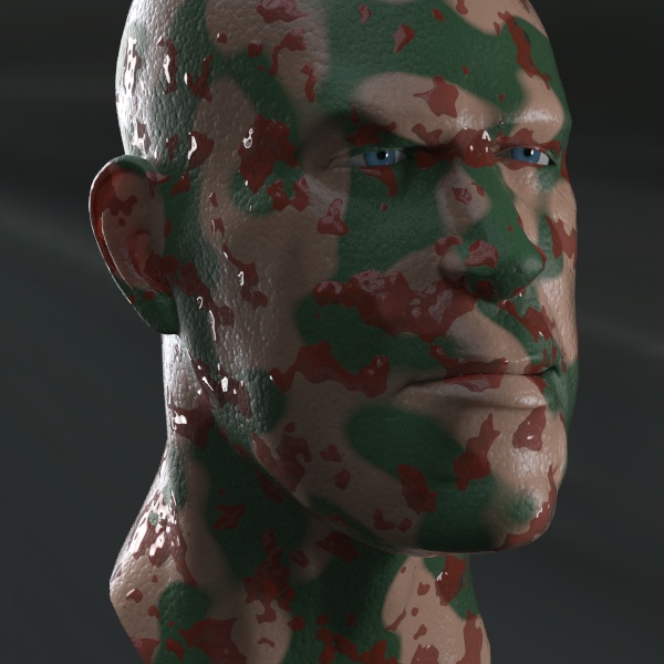
...and now we can see a little bit "through" the blood.
We are now at four layers housing 8 individual layer shaders, and there is really no end to what can be piled on. Again, the above image shows a simple model with childish procedural textures, and it still looks passable. Imagine if every texture was created by an artist, where this could go....
Just to remind us that layering is logical rather than physical, we add a mila_transparency on top of all the other layers in the "overall" layers, with a checkerboard texture, and get this result:
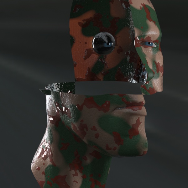
We created a global cutout above! We are now staring into the (empty) head of this poor blood-soaked warpainted guy.
We did this to clearly illustrate the logic of the layers. Transparency slapped on top, at 100% weight, makes it 100% transparent - period. That we have mud-caked-bloody-warpainted soldier guy under makes no difference - it's 100% transparent. Also, note that if using the "visibility" input of the mila_material instead of a transparency layer, this cutout will show up properly in the z depth buffer and in a matte created by assinging input to an extra_color buffer.
This allows many powerful effects. And ordering the layers gives a lot of control. For example, lets swap out the "transparent" shader for a mila_reflection layer with a grid bump map, and we get this:
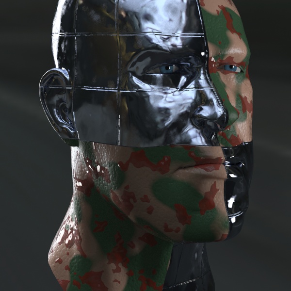
Ah, now I don't feel so bad for the guy any more. I think it starts to look like Arnold Schwarzenegger a little bit. However, wouldn't it make sense if the blood was also on top of the metal bits?
A simple swap of the "dirt" (which is really blood) to put it on top of our reflection metallic layer, and we get:
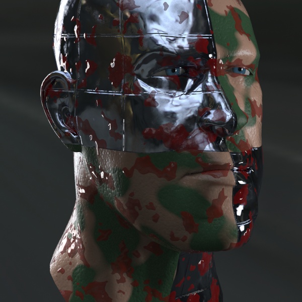
....and so on, and so on. As we can see, there aren't really any hard limits. And it's not even as if we are piling on render time either. Yes, 400 layers could take a lot of time simply by the overhead of managing the amount of layers (then again, not necessarily, if the top layer is opaque diffuse, none of the other layers are ever executed), but the amount of artist control, and the limitless look-development possibilities makes this a very attractive shader package.
The layering shaders are the most comprehensive library available for mental ray shading, and will support both hard and soft, organic and inorganic surface properties easily. The mixability is endless.
Go forth and Create!