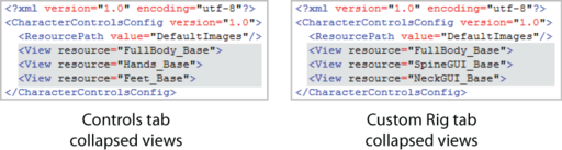
You can customize the HumanIK window Controls and Custom Rig tabs by editing the CharacterControls.xml file in a basic text editor such as Notepad or Programmer's Notepad. You can edit the look of the HumanIK tabs to accommodate your workflow or animation rig by changing the layout.
The CharacterControls XML configuration files is in the CharacterControls directory (C:\Program Files\Autodesk\<Maya version>\resources\CharacterControls). See Edit the HumanIK Character Controls layout for a description of the areas you can customize.
Open the Character Controls configuration file
To open a configuration file so you can edit it
- In a text or XML editor, navigate to:
- Windows: C:\Program Files\Autodesk\<Maya version>\resources\CharacterControls
- Mac OS X: /Applications/Autodesk/<Maya version>/Maya.app/Contents/resources/CharacterControls
- Linux:/usr/autodesk/Maya/resources/CharacterControls
Note:By default, CharacterControlsConfig.xml and CustomRigControlsConfig.xml are created in this directory at installation. These files are used to create the default layouts for the Controls and Custom Rig tabs.
- Select the configuration file you want to edit.
Note: Each time you edit the configuration file in an external editor, you must load the file in Maya in order to see your changes. See Save and load a HumanIK character layout.
HumanIK Character controls configuration file description
The following diagram shows the Full Body view in the CharacterControlsConfig.xml file and highlights its main areas and elements.
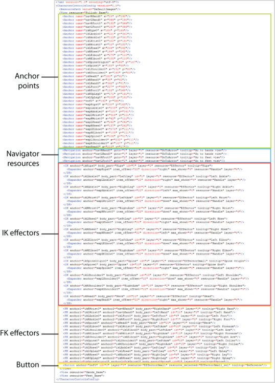
Main Elements
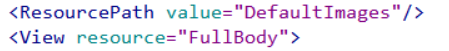
Each section in the configuration file uses the following resource elements, for example, <View resource="FullBody">: for resources specific to the Full Body, <View resource="LeftHand"> for resources specific to the left hand, <View resource="RightFoot">, for resources specific to the right foot, and so on.
If you want to use images stored in a different location than the default, you need to modify the corresponding resource element so it points to right folder. See
| Element | Description |
|---|---|
| <ResourcePath> |
Identifies the directory that contains the image resources. |
| <View resource> |
Encloses all of the elements for the view and identifies the background image. |
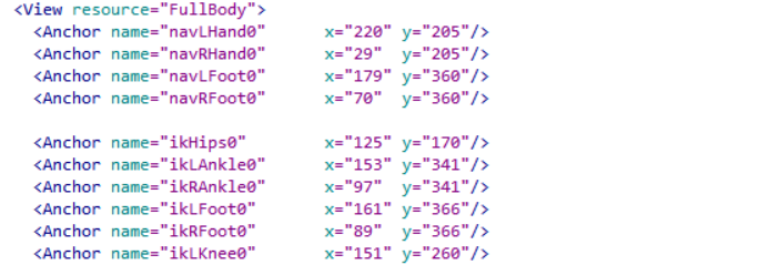
Anchor points
The configuration file is built upon the concept of anchor points, 2D x and y coordinates that are used to define the location of other elements in the layout. Anchor points are linked to other elements. As a result, the anchor point coordinates determine the location of these elements about the layout.
You can attach a navigator resource or an IK effector to an anchor point.
| Attribute | Description |
|---|---|
| <name> |
Provides a name for the anchor point. |
| <x> |
The x coordinate for the anchor point. |
| <y> |
The y coordinate for the anchor point. |
Navigator resources
 , which lets you expand to view a detailed segment of the character layout, like the hand or foot.

| Attribute | Description |
|---|---|
| <name> |
Provides a name for the navigator resource. |
| <goto> |
This number identifies the view that is connected to the navigator resource. |
| <layer> |
This number corresponds to the layer that is assigned to the navigator resource.
Tip: The layering system allows you to layer different elements on top of each other in the layout.
|
| <resource> |
The name of the image that is used for the navigator resource. |
| <tooltip> |
Annotation text for the navigator resource. This text displays when you hover over the navigator button in the layout. |
IK effectors
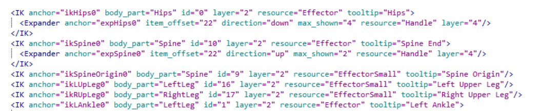
| Attribute | Description |
|---|---|
| <anchor> |
Identifies the anchor point that defines the location of the IK effector. |
| <body_part> |
Identifies the body part keying group for the IK effector. For example, LeftLeg, RightLeg, RightArm, or LeftArm. See Manipulation and keying modes. |
| <id> |
The internal ID for the IK effector. |
| <layer> |
This number corresponds to the layer that is assigned to the IK effector. |
| <resource> |
The name of the image that is used for the IK effector. |
| <tooltip> |
Annotation text for the IK effector. This text displays when you hover over the IK effector in the layout. |

| Attribute | Description |
|---|---|
| <anchor> |
Identifies the anchor point that defines the location of the effector handle. |
| <item_offset> |
This number represents the offset between the extra effector handle and the first extra effector, in pixels. |
| <direction> |
Indicates the direction in which the handle expands: up, down, right, or left. |
| <max_shown> |
Sets the maximum number of extra effectors that can be added to the expander handle. |
| <resource> |
The name of the image that is used for the effector handle. |
| <layer> |
This number corresponds to the layer assigned to the IK effector. |
FK effectors

| Attribute | Description |
|---|---|
| <anchor1> |
The anchor point that defines the location in the layout where the effector starts. |
| <anchor2> |
The anchor point that defines the location in the layout where the effector ends. |
| <body_part> |
The body part keying group for the FK effector. For example, LeftLeg, RightLeg, RightArm, LeftArm. See Manipulation and keying modes. |
| <id> |
This number is the internal ID assigned to the FK effector. |
| <layer> |
This number corresponds to the layer that is assigned to the FK effector. |
| <tooltip> |
Annotation text for the FK effector. This text displays when you hover over the FK effector in the layout. |
Buttons

| Attribute | Description |
|---|---|
| <anchor> |
Identifies the anchor point that defines the location of the button. |
| <id> |
The internal ID for the button. |
| <layer> |
This number corresponds to the layer that is assigned to the button. |
| <resource> |
The image used when a cell is not selected. See Cell status. |
| <resource_selected> |
The image used when a cell is selected. See Cell status. |
| <resource_active> |
The image used when a cell is assigned. See Cell status. |
| <tooltip> |
Annotation text for the Button. This text displays when you hover over the button in the layout. |