Select Entity from Vault is a GUI workflow that allows the user to navigate the vault and select an entity for an event.
The event can be to Open, Save, or any other event workflow. The labels and buttons in the GUI can be customized to support the workflow.
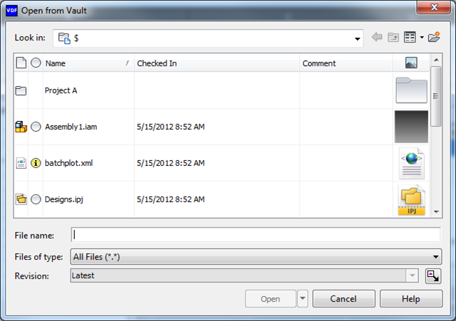
The Select Entity from Vault dialog can be used to select files, folders, items, or any other vault entity.
| Look in Customization | |
|
The top level entities in the Look In combobox can be configured. These entities are always visible and they can be expanded to show children as the user drills down the hierarchy. 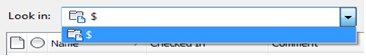 |
|
| Persistence | |
|
The dialog remembers its settings (column configuration, view type, and other options). The caller can configure how the options are saved. For example, an Open and a Save workflow can share the same dialog settings, or each workflow can have its own settings. |
|
| Select Revision | |
|
The revision control allows the user to select a particular file revision for the Select Entity from Vault event. This feature can be disabled. When disabled, the combobox and its label are removed from the dialog. 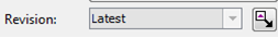 |
|
| Released Biased | |
|
The released biased option is a toggle button that can be included on the dialog to indicate whether released data should take priority over non-released data when an entity in the vault is selected. For example, if there are two revisions of a file in the vault, and one of them is in a released state, the selection automatically defaults to the released revision. The Release Biased toggle button can be configured to default to released or non-released. |
|
| Multi-select | |
|
The dialog can support the selection of multiple entities or just a single entity. |
|
| Configurable Text | |
|
The following elements can have their text replaced by user-specified values:
|
|
| Configurable Text | |
|
The filters (e.g., Files of Type in the dialog image) can be configured. Filters based on file type, regular expression, or any other custom algorithm can be added to the combobox. 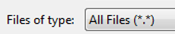 |
|
| Action Button Options | |
|
The action button text can be customized (e.g., Open, Save, etc.). Additionally, the action button can be granted options which display as a drop-down menu. For example, the Open button could have a drop-down menu with choices that include Open (Check Out), Open (Check Out All), and Open (Read Only). 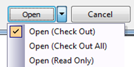 |
|
| Target Entity | |
|
Configure the entity type on which the select entity action takes place. For example, if the dialog is configured to act only on files, then if an item is selected the action button (in this case, Open), would be disabled. |
|
| Initial Vault Location | |
|
Configure the default vault location that displays when the dialog is activated. If the default location is not specified, the dialog displays the files located at $/. |
|
| Entities to Hide | |
|
Configure the dialog so that only certain entities are shown when the user navigates the vault. For example, if the user is selecting an attachment for FOO.TXT, then it is reasonable to hide FOO.TXT from the selection list. |
|
| Restrict Navigation | |
|
If restrict navigation is enabled, then the dialog displays only the contents of the Initial Vault location. The user cannot drill down into folders or other containers. |
|
| Sidebar Control | |
|
An optional control can be included on the left edge of the dialog as a way for developers to add additional functionality to the dialog. A control may also be placed on the bottom left edge of the Open/Cancel/Help button area. 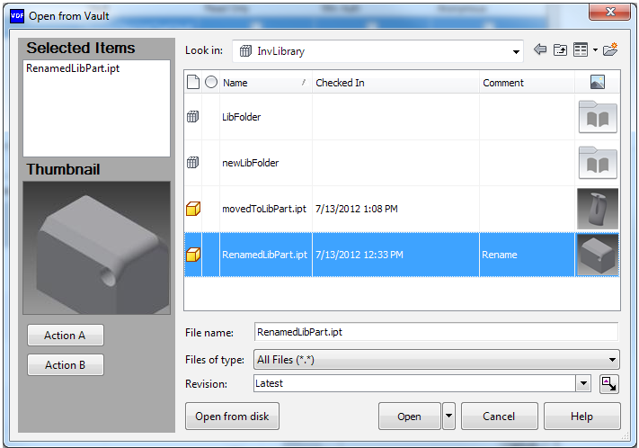 |
|
| Validate Extensibility | |
|
A custom handler can be supplied to validate the operation when the action button is clicked. The handler can display any prompts or errors as it sees fit, and it can decide whether or not the dialog box should close. |
|
| Context Menus | |
|
The context menus that display when the user right-clicks on any of the files in the grid can be customized. |
|
| View Switcher | |
|
The display can change between a details view, list view, small icon view, or large icon view. The icon views support zooming in and out of thumbnails. |
|
| Grid Configuration | |
|
The grid has all of the capabilities of the Vault Browser Control. |
|