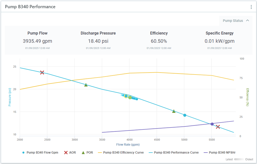
Create a pump performance chart to compare a pump's actual performance to manufacturer specifications.
You can use a pump performance chart to see:
- Flow vs Pressure
- Flow vs Power
You can add manufacturer curves (pressure, head, power, efficiency, or system curves) as references on your chart to compare these to actual performance.
You can also include pump properties (flow rate, pressure, efficiency, and brake hp) in order to plot pump rated capacity and to calculate efficiency.
Configure a Pump Performance Chart
- In your workspace, choose Add Component
 Pump Performance Chart.
- Enter a name and description.
- Type: Choose which kind of sensor data you want to include (Flow vs Pressure or Flow vs Power). You can add more data as reference charts later. See below.
- Flow rate (X-Axis): Select a flow rate sensor.
- If this is a pressure curve:
You can work with booster pumps by incorporating upstream and downstream pressure sensors. If you have a vertical separation from the discharge valve and the physical pressure sensor, you can add fixed head (pressure) corrections.
- Discharge/Downstream Pressure: Select a pressure sensor.
- Discharge Fixed Correction: This value will be subtracted from the discharge pressure sensor and must be in the same unit of measurement as the pressure sensor reading (e.g., PSI).
- Suction/Upstream Pressure: This field can be used to add a booster pump. If this field is populated, the differential pressure would be calculated and plotted by subtracting the suction pressure (and any fixed correction) from the discharge pressure.
- Suction Fixed Correction: This value will be subtracted from the suction pressure sensor and must be in the same unit of measurement as the pressure sensor reading (e.g., PSI).
- Y-Axis: Choose whether to display pressure, head, or both units of measurement on the left (pressure) Y-Axis.
- If this is a power curve:
- Y Axis: Select a power sensor. This will always place a fixed power Y-axis on the right side of the Pump Performance Chart.
- Series: Select the data series type for the chart.
- Resolution: Select the data interval for the chart.
- Time Range: If you want to show data for a specific time period in your chart, turn this on and then select the specific dates or how many days to go back (time offset).
- Then click Submit.
Pressure (or Head) values are always represented on the left Y-Axis, while Power and Efficiency values are represented on the right Y-Axis.
Add Reference Charts
To see more than one data set on your chart, you can add reference charts. These may be additional Pump Performance Charts or Manufacturer Curves.
To add a reference chart:
- Click on the three dots
 beside your chart and select Configure.
- Then, click on the References tab.
- Click on the Add Reference drop-down and then select the type of reference data.
Manufacturer Curves
Add a Manufacturer Curve (pressure, head, power, efficiency, or system curves) as a reference to compare actual pump measurements with manufacturer specifications.
You can select a curve that was already uploaded or you can use the Create New Pump Curve button to upload one. See Upload Pump and Tank Curves for upload instructions.
If curve units are different to the primary sensor's units, these will be converted whenever possible. For measurements such as power or efficiency, another y-axis is added on the right.
Pump Performance Charts
Add an additional pump performance chart to overlay additional pressure readings. For example, to compare two pumps of the same specification or to see both Power and Pressure readings for the same pump.
These are configured in the same way as the Pump Performance Chart component. See above.
Add Pump Properties
Add pump properties in order to plot pump rated capacity on your chart and to calculate efficiency.
You can also add pump operating ranges to plot these on your chart.
To add pump properties:
- Click on the three dots beside your chart
 and select Configure.
- Go to the Pump Properties tab.
- Under Pump Rated Capacity you can enter values for Flow Rate, Pressure, Efficiency, and Brake HP.
Flow Rate and Pressure are used to plot the pump rated capacity, while Efficiency and Brake HP are used to calculate the pump's efficiency points.
- Under Operating Ranges, you can enter the Allowable Operating Range (AOR), the range within which the pump can operate without risking damage, and the Preferred Operating Range (POR).
To display these on the chart, the range limits are multiplied by the flow rate to get the X data points, and linear interpolation is used to calculate the Y data points.
Customize Display
- Click the three dots icon
 beside your chart and select Configure.
- Then click on Display Options.
- Here you can set custom X and Y ranges and labels, as well as change how the sensor series data is displayed.
To change the color or style of reference data sets:
- Go to the References tab.
- Click the three dots icon
 beside the reference and select Edit.
- Click on Display Options.
- Modify the style settings and then click Update.
Example Pump Performance Chart

In this chart, several references and properties have been added, and we can see:
- In blue, Flow vs Pressure for Pump B340, as well as the manufacturer pressure curve. The latest data point is highlighted in yellow.
- In purple, the manufacturer NPSHr curve.
- In yellow, the manufacturer efficiency curve.
- The Pump Rated Capacity point represented by a large green dot. You can see how far actual pump performance is from optimal performance.
- The Preferred Operating Range (POR) represented by green triangles.
- The Allowed Operating Range (AOR) represented by red crosses.