
The Vault Browser control is used for displaying detailed information about the entities stored within a vault. It supports all types of entities and all types of properties. Multiple views are available within the grid including list view, icon view, and detail view. Object data is displayed in the grid using a spreadsheet-like layout of rows and columns. Each column in the grid represents a property in the vault. The grid can be customized by the end-user to show only the properties that are of interest.
Available Views
| Detail Grid View | |
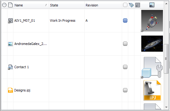 |
|
| List View | |
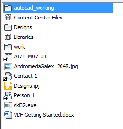 |
|
| Thumbnail View (medium icon view) | |
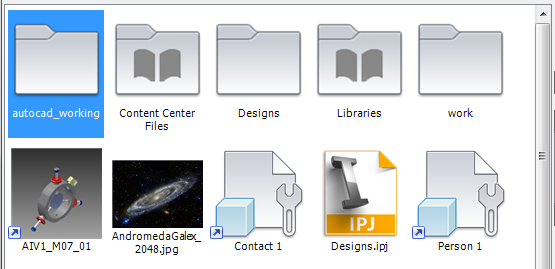 |
|
File Browsing Grid Control Features
| Column Customization and Persistence | |
|
Columns in the grid control can be dragged and dropped in any order. All available columns are visible in a column chooser dialog to be added to the grid. The control remembers the custom column configuration and restores it the next time that the control is loaded.  |
|
| Column Header Context Menu | |
|
The context menu for each column header provides a number of options for customizing the information presented in that column.  |
|
| Column Quick List | |
|
The column quick list provides easy access to often-used columns, so they can be shown or hidden in the grid. 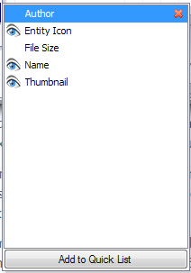 |
|
| Custom Properties/Columns | |
|
New properties and their corresponding columns can be created programmatically and added to an instance of the browser control. They operate exactly like columns created by the framework itself, except the data and configuration is provided by you. In the following image, the checkbox column and the Local Path column are both custom properties.  |
|
| Custom Styling | |
|
The fonts, foreground, and background colors of entities in the detail grid view are fully customizable. This customization can either be done on a per-row basis, or on individual cells in a specific column. 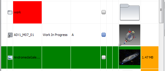 |
|
| Custom Tooltips | |
|
The default tooltip behavior of the detail grid control can be overidden. A custom tooltip handler can be associated with a column across all browser controls, or can be associated with a specific vault browser control. 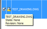 |
|
| Customizable Context Menus | |
|
The context menus created when right-clicking in the body of the control are completely customizable. The control provides a default set of entries based on where the user clicked. These items can be added to, removed, or modified at will. The context menus for the column headers are not currently customizable. 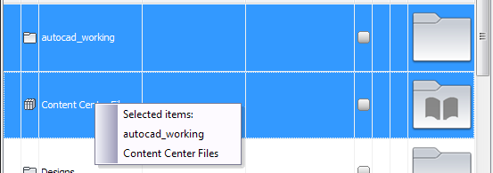 |
|
| Entity Filtering | |
|
Specific entities can be filtered out of the list of displayed entities. You provide your own function as the filter. Each entity is passed through the filter before it is displayed, giving you a chance to hide it. |
|
| Find Panel | |
|
This panel can be activated from the column header context menu. When active it can be used to search the current list of entities. As you type, the list is filtered down to only entities matching the search text.  |
|
| Hot Cells | |
|
Columns in the grid can be customized to turn their cells into "hot cells." These cells can have a custom tooltip, and when CTRL clicked they can perform a custom action. As shown in the following image, files that are assigned to an item can use the hot cell mechanism to link to that item.  |
|
| Incremental Search | |
|
When focus is on the grid control it will search as you type, selecting and jumping to whichever item in the list matches the typed characters. |
|
| Override Selection | |
|
When right-clicking outside the collection of currently selected entities, the grid control supports a temporary override selection in all of its available views. This selection lasts as long as the context meny is up and temporarily replaces the regular selection reported by the control. This can be programmatically enabled or disabled.  |
|
| Pluggable Navigation Models | |
|
The vault browser control supports plugging in different navigation models that conform to a specific interface. These models control how the grid responds to user input. There are two pre-made models: a vault browsing model and a vault viewing model. The browsing models is designed for navigating through a vault and drilling down into containers such as folders and items. The viewing models is designed to view a collection of vault entities without any navigation. |
|
| Single Select & Multi-select | |
|
The browser control supports selecting multiple entities at a time or a single entity at a time. You can programmatically switch between these two modes. |
|
|
Support for Custom Entities |
|
|
The browser control has full support for custom entities. All of the features that operate on files and folders also work with custom entities.  |
|