
This dialog is used to change the appearance of buttons on the toolbars.
The dialog is displayed as follows:
- Select Tools
 Customise toolbars to open the Customise dialog.
- Select Commands in the left panel of the Customise dialog.
- In the product toolbar, select the button whose appearance you want to change.
- On the Commands page of the Customise dialog, select the Modify selection button to show a drop-down menu.
- Select Button Appearance from the drop-down menu.
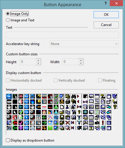
| Dialog item | Description |
|---|---|
| Image only | When selected, the button is shown on the toolbar as an icon, without accompanying text. |
| Image and text | When selected, the button is shown on the toolbar as an icon accompanied by text. The text used is shown in the Text box underneath. |
| Text | This is the text that will accompany the icon on the toolbar if Image and text is selected above. You can enter text into this box if the Image and text option is selected. |
| Accelerator key string | This feature is not currently active. |
| Custom button sizes | This feature is not currently active. |
| Display custom button | This feature is not currently active. |
| Images | The image selected here will be used for the button icon. |
| Display as dropdown button | If ticked, the button will be displayed as a drop-down button on the toolbar. |