In this exercise, you create and modify a contrast curve using control points.
With the piecewise linear contrast curve, you can place up to 64 control points through which the curve is automatically drawn. You make the image adjustments by dragging the control points to change the shape of the curve. The curve is constrained so that for each possible input value in the selected area, only one new output value is established. With this form of tonal adjustment any image can be made more useful.
Related Exercises
- Exercise P4: Enhancing Grayscale Images
- Exercise T1: Using the Histogram
- Exercise T3: Using the Fitted Contrast Curve
Before doing this exercise, ensure that AutoCAD Raster Design toolset options are set as described in the exercise Exercise A1: Setting AutoCAD Raster Design Toolset Options.
Exercise
- In the\Tutorial8 folder, open the drawing file
TonalAdjustment02.dwg. If necessary, enter
REGEN to see the vector data on top of the image.
Start tonal adjustment
- Click
Raster menu
 Image ProcessingHistogram. Enter
e (Existing) to indicate that you will use an existing closed vector entity to define a sub-region for analysis.
Image ProcessingHistogram. Enter
e (Existing) to indicate that you will use an existing closed vector entity to define a sub-region for analysis.
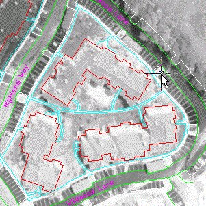
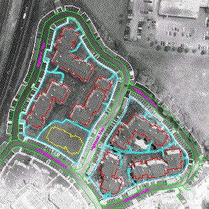
- Pick a point on the edge of pavement (light gray) line for the lower right area.
 Note: In a real project, if you did not have an existing closed vector entity around the region where you want to adjust tone, you could create a polygon especially for this purpose.
 - In the Histogram dialog box, click the Tonal Adjustment tab.
- In the
Select Curve Type box, select
Piecewise Linear.
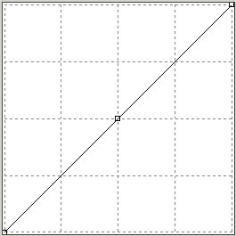
The straight line in the contrast window indicates the initial linear relationship between input tonal values from the image across the bottom (black on the left, white on the right) and their corresponding display values on the vertical (black at the bottom, white at the top). Because of this relationship, moving the line up and down uniformly tends to change the brightness of all the values. Similarly, changing the slope of the line tends to change the contrast for all the values. But if we make the graph non-linear and manipulate several control points, we can change the output brightness and contrast for different ranges of input tones in the image.
- Place your cursor over the control point in the middle of the line. Note that the cursor turns into a move cursor. When you click and drag it, a tooltip reports its current position. By dragging the point diagonally between upper left and lower right corners you can see the effect on the histogram of manipulating the resulting nonlinear curve.
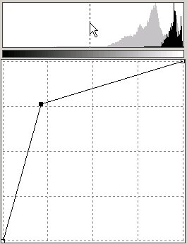
Moving the control point to the upper left makes the gray tones much whiter; moving it to the lower right makes them much darker.
- Move the control point to a spot near 225,150, stretching the histogram to the left and separating the peaks. The left segment of the curve is mostly lowering the brightness and increasing the contrast for the roof and landscaping tones; the right segment is mostly lowering the contrast for the lighter tones. In the histogram we see this in the left peak (roof & landscaping tones) as a move to the left which is decreasing brightness and some compression of the peak which is decreasing contrast. For the right peak (representing the building facade and walkway tones) we see a stretching effect which is increasing contrast and some movement to the left which is decreasing brightness.
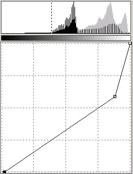
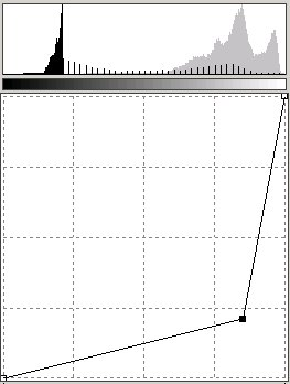
- To regain the original contrast in the roof and landscaping tones, put the slope for that section back to a 45-degree angle by adjusting the left (black) triangular slider at the bottom of the Contrast window. Move the black slider in until the black cutoff is at about 84. The fact that the curve is horizontal at 0 output value between input values of 0 and 80 is immaterial, as there are few or no pixels within that range in the original lower right area of the project.

The curve is now quite nonlinear, applying different correction factors to different tonal values in the area. The original idea was to make the histogram curve look more like the one in the upper left area of the project. Compare the current result for the upper left area with the one for the lower right area.
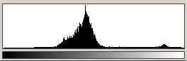
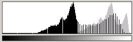
The main histogram peak from the lower right area, while different in shape than the peak from the upper left area, occupies the same basic range of output values. The higher prevalence of elements to the right of the main peak in the lower right area histogram is because more building sides and concrete work (both of which are fairly light) show in that part of the project.
- Save the curve for future use by exporting it to an external file. In the Histogram dialog box, click Export to display the Export dialog box. Set the directory to \Tutorial8. Enter Tutorial02 for the filename and leave Gamma Point List (*.gpl) as the file type. Click Export.
- In the Histogram dialog box, in the Apply Changes To area, click Sub-region.
- Click
Apply to update the lower right part of the project image. Click
Close to exit the dialog box. The end result is an image where both upper left part and the lower right part are similar in tone.
The only areas that still need correction are some parts of the roadway. This is addressed in the next exercise, Exercise T3: Using the Fitted Contrast Curve.
- Close the drawing without saving changes.