Use the Dragged State tab of the Label Style Composer dialog box to define leader visibility and properties for dragged label text.
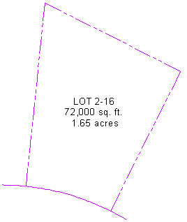
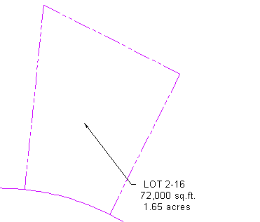
Default label location
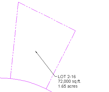
Dragged label with leader
A leader line remains attached to the original insertion point of the label and stretches to the label’s new location. A leader can be drawn with an arrowhead and can be a straight line or a spline curve.
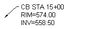 Straight leader |
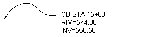 Spline leader |
Text in a dragged label is stacked according to settings that you specify in the Dragged State tab of the Label Style Composer.
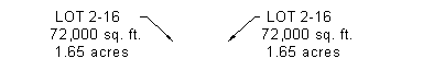
You can display dragged label text as you composed it originally, or as stacked text, as shown in the following illustrations:
Label “As Composed”
Stacked label
When stacked, all blocks, lines, and direction arrows are removed.
Label text is left-justified when the leader is on the left side of the text and is right-justified when the leader is on the right, as shown in the following illustration.
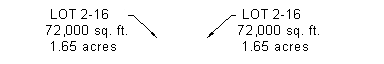
However, you can set the label text to be always left-justified regardless of the location of the leader, as shown in the following illustration.