26. Unique Codeblocks
Codeblocks that are unique to Informed Design
Informed design makes use of Google Blockly in the rules workspace of a Product Definition, to specify the layout, logic and behavior of the Input Form.
The following Codeblocks are unique to Informed Design's implementation of Blockly and have been added to the standard Blockly library of blocks available. If you're interested in learning more about Blockly, Click here to check out this Wikipedia article on the subject.
Click here to learn how to create an Informed Design Product Definition in Inventor.
How to use Informed Design Codeblocks in the Input rules of a Product Definition to set and get Input Parameter properties (i.e. value, lists, min, max, visibility, etc.), add comments, and print messages.
Input Parameter Codeblocks

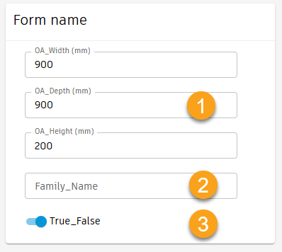
Input Parameter Codeblocks are used to Set and Get the properties of Form Input Controls. Form inputs are based on the parameters which are adopted from the CAD model. The inputs are derived form, and control the CAD model.
Input Parameter Codeblocks are used to:
- Get or Set the value of an Input.
- Get or Set the values (the list of values to choose from) of an Input
- Get or Set the minimum value allowed for a numeric Input
- Get or Set the maximum value allowed for a numeric Input
- Get of Set the increment that the value of an Input must adhere to
- Get or Set the Visibility of an Input
- Get or Set the Read Only status of an Input
- Get or Set the Applicable status of an Input
- Get or Set the Label text for an Input.
- Get or Set the message associated to an Input that appears on mouse over of the information icon to the right of a control in the Form
- Get or Set the Error state of the error icon to the right of a control in the Form
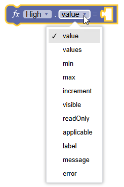
Input Parameter Codeblocks: available properties are based on the adopted parameter data type
Adopted parameters can be Numeric, Text, or Boolean (true/false).
- Numeric
- Text
- Boolean
The available properties for an Input are determined by its adopted parameter data type.
Adopted Parameter Data Type
| NUMERIC | TEXT | BOOLEAN | PROPERTY DESCRIPTION |
|---|---|---|---|
| value | value | value | Get or Set the value |
| values | values | X | Get or Set a list of values |
| X | X | trueLabel | Get or Set the input Label, if True |
| X | X | falseLabel | Get or Set the input Label, if False |
| min | X | X | Get or Set the minimum value. |
| max | X | X | Get or Set the maximum value. |
| increment | X | X | Get or Set the value increment. |
| visible | visible | visible | Get or Set the visibility of the input on the form. |
| readOnly | readOnly | readOnly | Get or Set the input on the form to read only. |
| applicable | applicable | applicable | Get or Set the input applicable state (indicates whether a parameter is applicable to the current configuration) |
| label | label | label | Get or Set the input label. |
| message | message | message | Get or Set the input message on mouse over of information or error icon to the right of the input control |
| error | error | error | Get or set the input error state for the error icon to the right of the input control |
Get and Set Input values using the Input Parameter Codeblocks
How to Get and Set Input values with the Informed Design Input Parameter Codeblocks.
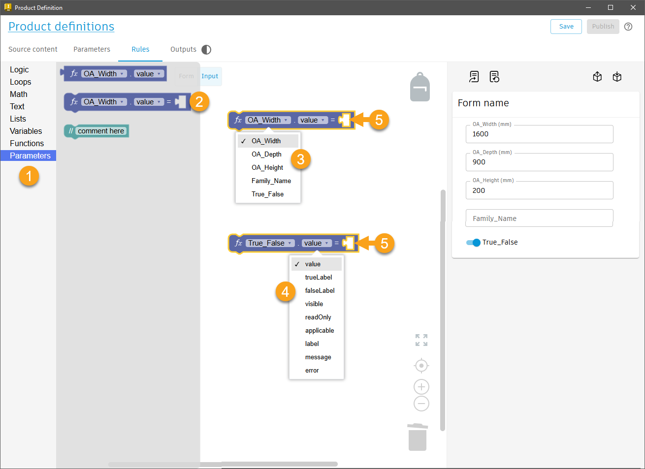
To SET an Input Parameter value.
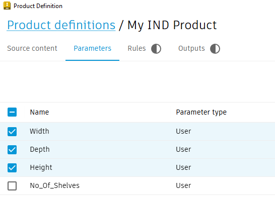
Open a Product Definition and navigate to the Rules Tab > Input workspace.
- From the Codeblock library, select the Parameters category.
- Select the 'Set' Input Parameter Codeblock and drag it into the canvas.
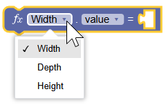
- From the Codeblock parameter name drop down list, select the desired parameter
- From the Codeblock property drop down list, select the value property.
- Plug in a Codeblock for setting the value or values list (a text or number block, or a text or number list).
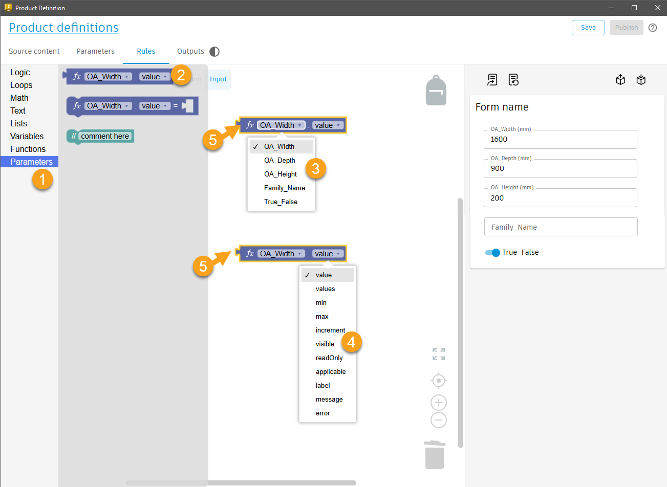
To GET the value of an Input Parameter.
Edit the Product Definition. Navigate to the Rules Tab > Input workspace.
- From the Codeblock library, select the Parameters category
- Select the 'Get' Input Parameter Codeblock and drag it onto the canvas
- From the Codeblock parameter name drop down list, select the desired parameter
- From the Codeblock property drop down list, select the value property
- Insert the 'Get' Input Parameter Codeblock into another Codeblock as its' value input.
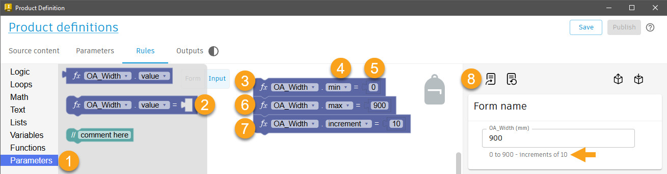
To Set the minimum, maximum, and increment value an Input Parameter Codeblock.
Codeblocks can be used to limit the allowable values for an Input on the Form.
How to set the allowable minimum, maximum, and increment value.
Edit the Product Definition. Navigate to the Rules Tab > Input workspace.
- From the Codeblock library, select the Parameters category.
- Select the 'Set' Input Parameter Codeblock and drag it onto the canvas.
- From the Codeblock parameter drop down list, select the desired parameter.
- From the Codeblock property drop down list, select the 'min' property
- From the Codeblock library, select the 'Math' category. Insert a numeric block and enter a value for the minimum allowed.
- Duplicate the connected blocks. Set the property to 'max', set the numeric block value to the maximum allowed.
- Duplicate the connected blocks. Set the property to 'increment', set the numeric block value to the increment allowed.
- Use the Update Form command to apply all Codeblock changes to the Form and then test the Form to see if it works as expected by entering values not allowed (i.e. too large or small or not incremented as specified).
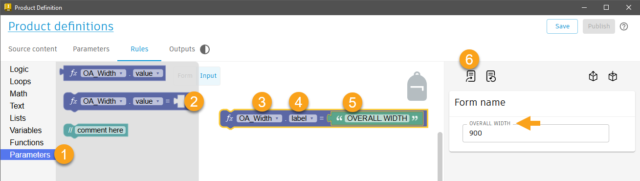
To Set an Input label with an Input Parameter Codeblock.
Codeblocks can be used to change the Input Labels on the Form.
How to set the Input labels on a Form with the Input Parameter Codeblocks.
Edit the Product Definition. Navigate to the Rules Tab > Input workspace.
- From the Codeblock Library, select the Parameters category.
- Select the 'Set' Input Parameter Codeblock and drag it onto the canvas
- From the Codeblock Parameter drop down list, select the desired parameter.
- From the Codeblock Property drop down list, select the 'label' property
- From the Codeblock Library, select the Text category. Insert a 'letter, word, or line of text' block to provide the value for the label.
- Use the Update Form command to apply all Codeblock changes to the Form and then review the Form labels to determine if they appear as expected.
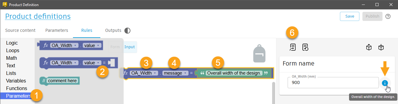
To Set an Input message with an Input Parameter Codeblock.
Codeblocks can be used to add a message to an Input on the Form.
This message appears on mouse over of the information or error icon that appears to the right of the Input on the Form
How to set an Input label message with an Input Parameter Codeblock.
Edit the Product Definition. Navigate to the Rules Tab > Input workspace.
- From the Codeblock Library, select the Parameters category.
- Select the 'Set' Input Parameter Codeblock and drag it onto the canvas
- From the Codeblock parameter list drop down, select the desired parameter.
- From the Codeblock property drop down list, select the 'message' property
- From the Codeblock Library, select the Text category. Insert a 'letter, word, or line of text' block to set the message text value.
- Use the Update Form command to apply Codeblock changes to the Form and review/test the 7. Form to confirm the message appears when it should and contains the desired message.
A blue information symbol will appear to the right of the Input on the Form. On mouse over, the message will be displayed.
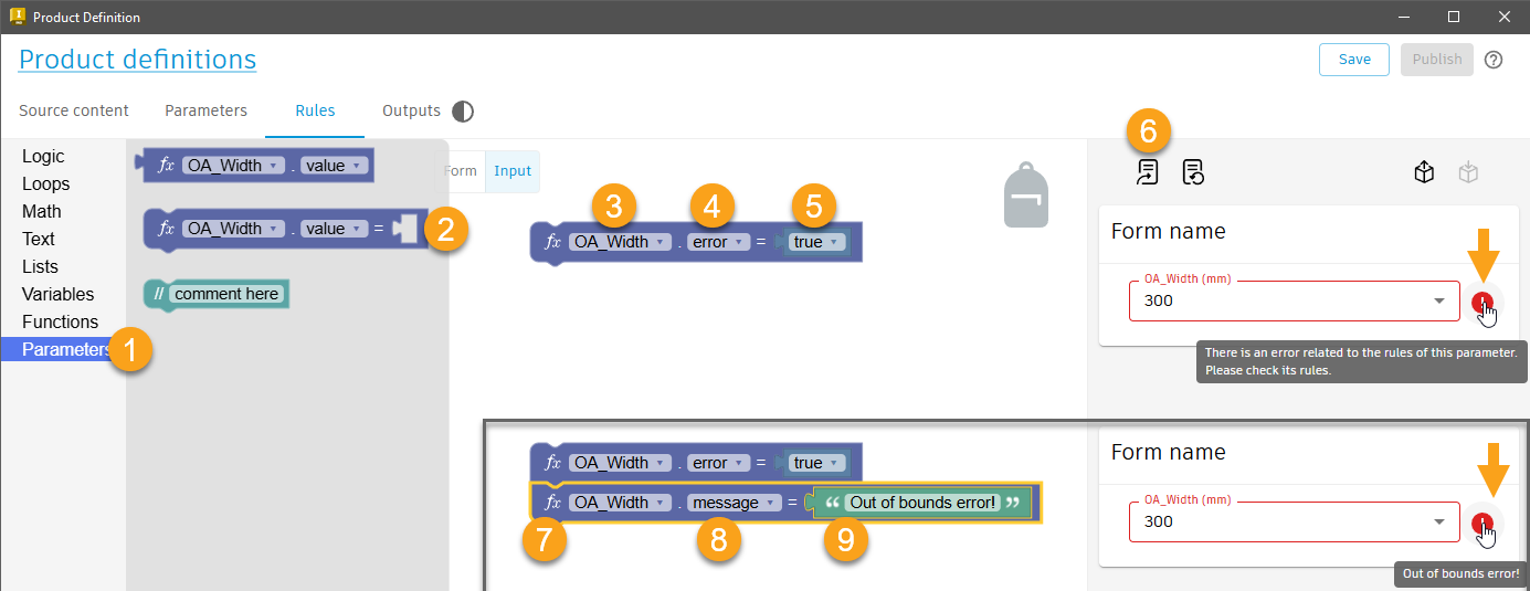
To Display an Error message for an input on the form with an Input Parameter Codeblock.
A Codeblock can be used to display an Error message for an Input on the Form.
How to display the Error message with an Input Parameter Codeblock.
Edit the Product Definition. Navigate to the Rules Tab > Input workspace.
- From the Codeblock library, select the Parameters category.
- Select the 'Set' Input Parameter Codeblock and drag it onto the canvas
- From the Codeblock Parameter drop down list, select the desired parameter.
- From the Codeblock Property drop down list, select the 'error' property.
- From the Codeblock library, select the Logic category. Insert a 'Returns either true or false' block and set its value to 'true'.
- Use the Update Form command to apply the Codeblock changes to the Form, then test your Form to see if the error message appears as expected. On mouse over of the error icon that appears to the right on the Input control, a generic error message will be displayed.
- (Optional) Connect a second Input Parameter Codeblock that references the same parameter, and use the 'message' property to customize the error message,
The Input border will turn red. An error icon will appear to the right of the input. On mouse over, the message will be displayed.
A product variant cannot be generated while an Input is in an error state.
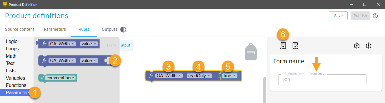
To Set an Input to read-only with an Input Parameter Codeblock.
A Codeblock can be used to make an Input read-only.
How to set the Input to read-only with an Input Parameter Codeblock.
Edit the Product Definition. Navigate to the Rules Tab > Input workspace.
- From the Codeblock library, select the Parameters category.
- Select the 'Set' Input Parameter Codeblock and drag it onto the canvas
- From the Codeblock Parameter drop down list, select the desired parameter.
- From the Codeblock Property drop down list, select the 'readOnly' property
- From the Codeblock library, select the 'Logic' category, insert a 'Returns either true or false.' Codeblock and set its value to 'True'.
- Use the Update Form command to apply the Codeblock changes and then test the Form to verify that the read-only state is set as expected.
When read-only is set to 'false', the Input can be edited. When set to 'true', the Input will be read-only, appear as 'greyed out' and "(Read only)" will be appended to the Input label automatically.
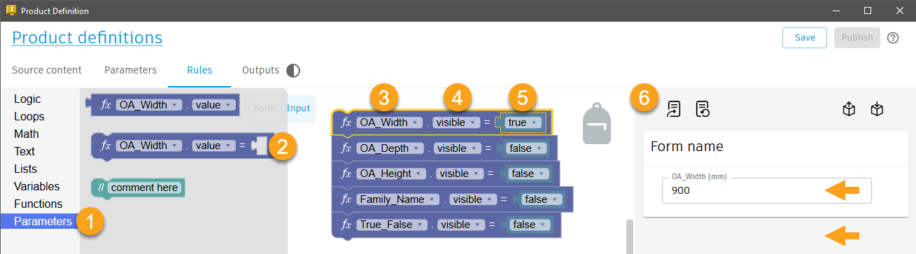
To Set Input Control Visibility with an Input Parameter Codeblock.
A Codeblock can be used to hide an Input Control on the Form
How to set the Input visibility with an Input Parameter Codeblock.
Edit the Product Definition. Navigate to the Rules Tab > Input workspace.
- From the Codeblock library, select the Parameters category
- Select the 'Set' Input Parameter Codeblock and drag it onto the canvas
- From the Codeblock Parameter drop down list, select the desired parameter.
- From the Codeblock Property drop down list, select the 'visible' property
- From the Codeblock library, select the 'Logic' category, insert a 'Returns either true or false.' block, and set the value to 'false'.
- Use the Update Form command to apply the Codeblock changes and then test the Form to confirm that the Input control visibility behaves as expected.
When visibility is set to 'true', the Input control will be visible. When set to 'false' the Input control will be hidden.
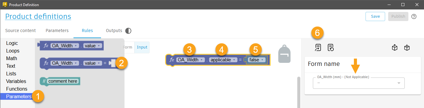
To Set an Inputs' applicable option with an Input Parameter Codeblock.
A Codeblock can be used to set the applicable option of an Input. Inputs that are not applicable to a configuration will be indicated in the Informed Design add-in for Revit > Customize and Insert dialog > Select table.
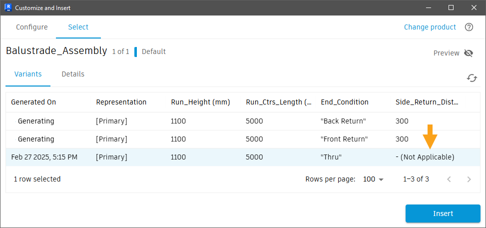
How to set the Input applicable option with an Input Parameter Codeblock.
Edit the Product Definition. Navigate to the Rules Tab > Input workspace.
- From the Codeblocks library, select the Parameters category
- Select the 'Set' Input Parameter Codeblock and drag it onto the canvas
- From the Codeblock Parameter drop down list, select the desired parameter.
- From the Codeblock Property drop down list, select the 'applicable' property
- From the Codeblock library, select the 'Logic' category, insert a 'Returns either true or false.' block and set its value to 'false'.
- Use the Update Form command to apply the Codeblocks changes to the Form and very that the applicable status is set and behaves as expected.
When 'applicable' is true, the Input can be edited. When it's false, the input will be read-only, greyed out, and the Inputs' label will automatically be appended with '(Not applicable)'.
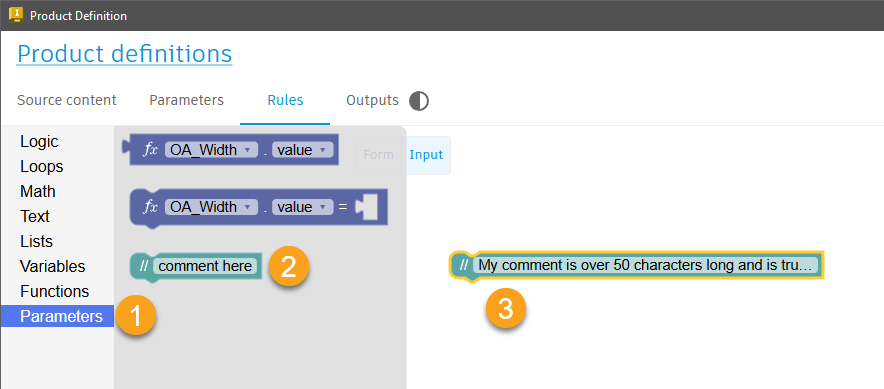
The Comment Codeblock
Use the comment Codeblock to communicate the intent of the Codeblock logic with inline comments.
How to add Inline comments with the Comment Codeblock.
Edit the Product Definition. Navigate to the Rules Tab > Input workspace.
- From the Codeblock library, select the Parameters category.
- Select the 'Comment here' Codeblock and drag it into the canvas
- Replace the "Comment here" default text in the Codeblock with your comment.
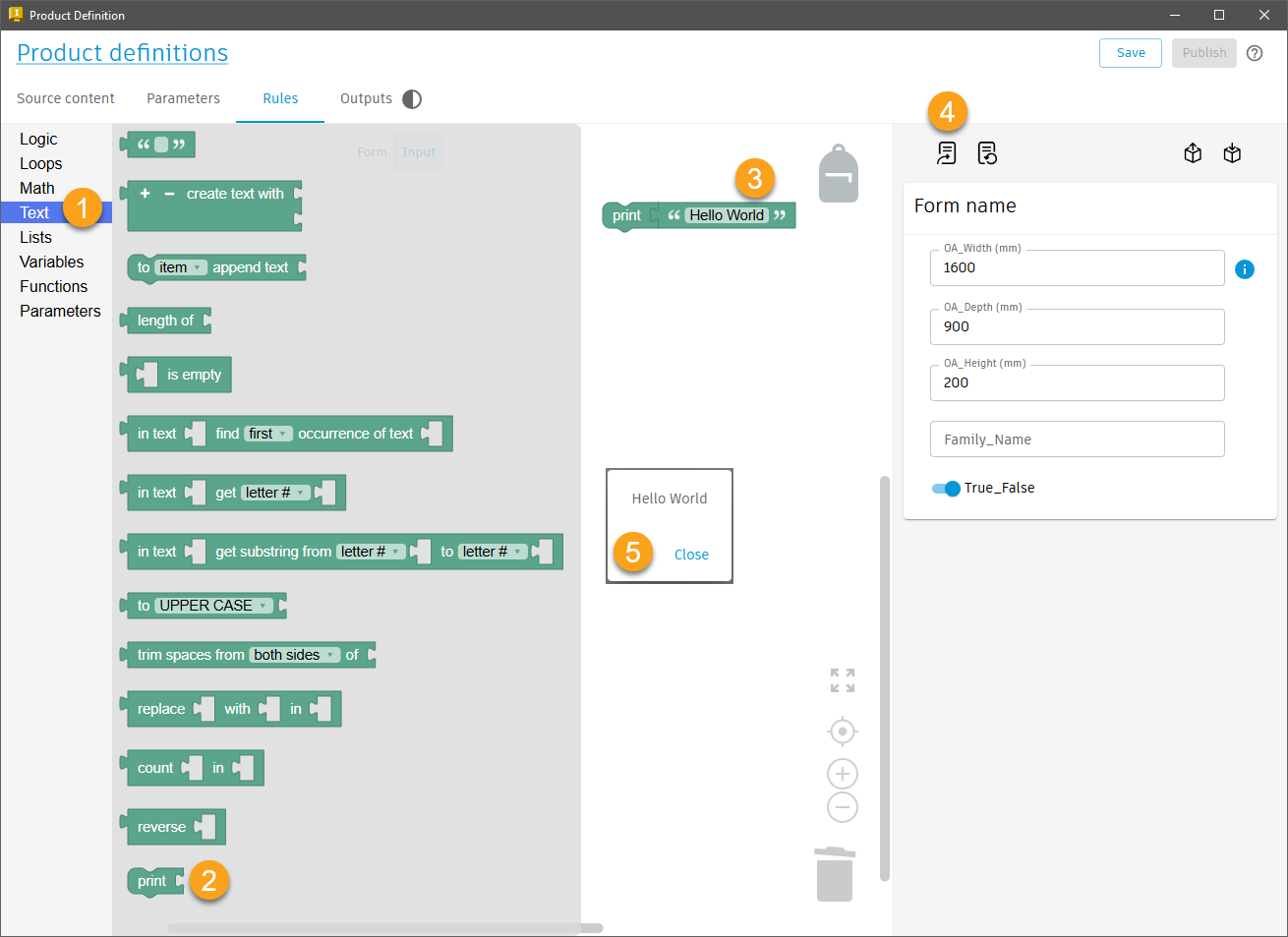
The Print Codeblock
The print Codeblock is used to display a message that will appear on screen when using the Informed Design add-in for Revit. The message can be triggered as the Revit user changes input values and makes selections in a product form.
How to 'print' values to a message box using Codeblocks.
Edit the Product Definition. Navigate to the Rules Tab > Input workspace.
- From the Codeblocks library, select the Text category.
- Select the Print Codeblock and drag it onto the canvas.
- Insert a text, or number Codeblock (also found in the Text category of the Codeblocks library), to hold the value to be printed.
- Use the Update Form command apply the Codeblock changes to the form.
- The result will display in a message box that pops up whenever an Input value is changed in the Form.