
Oct 23 | To spot anomalies and validate your data, you can add multiple data series for the same sensor with different intervals.
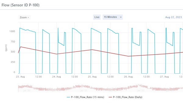
For example, you may want to see raw sensor data relative to hourly or daily data to help troubleshoot anomalies.
This can also help to understand how the raw data are distributed within an interval. For example, the exact time of the Open reading for an hourly interval.
See also: Overlay Different Sensor Intervals in a Historical Chart.