Customizing Pages and Views
Now that we’ve familiarized ourselves with navigation and our workflows, let’s dive deeper into how we’re tracking things to:
a) automate our workflows further, and
b) have consistent workflows across our studio.
Anyone can pin up to three columns in a grid.
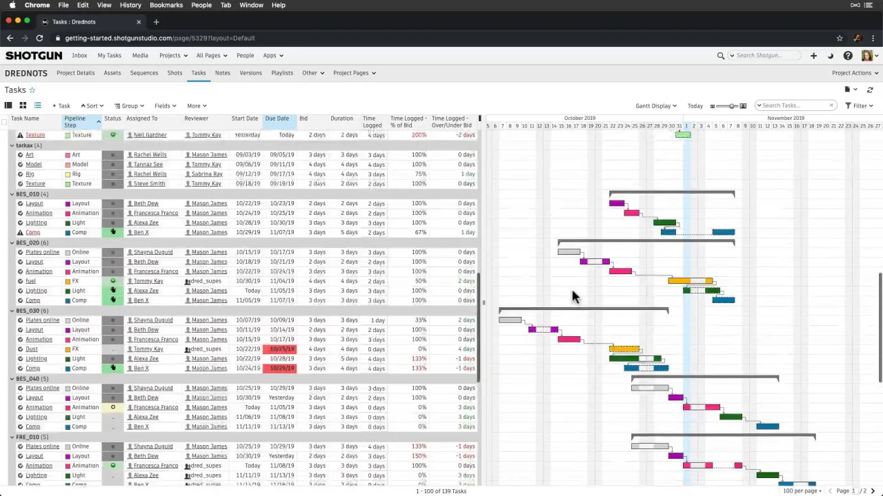
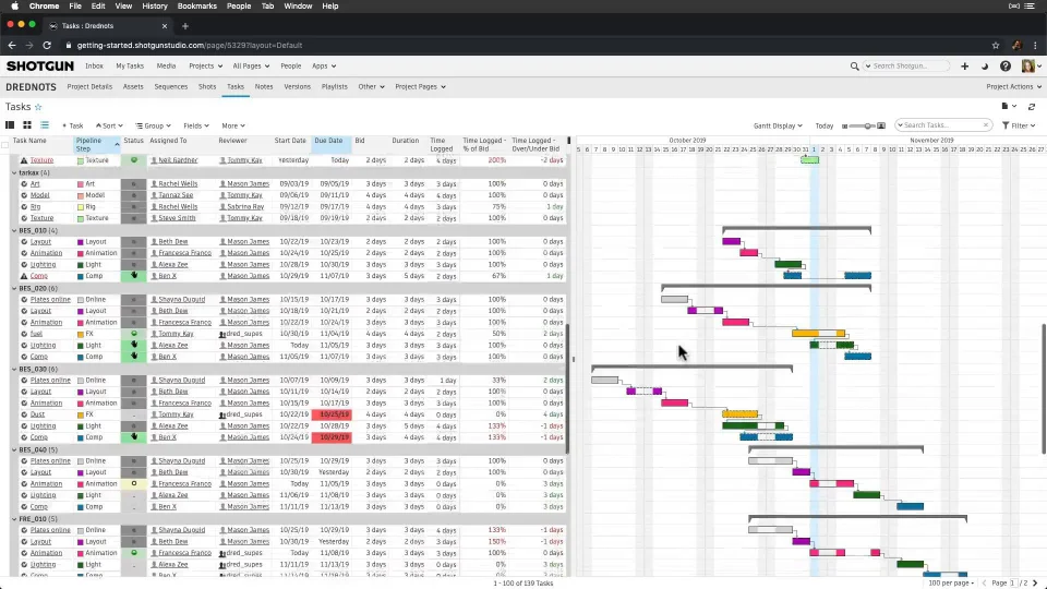
Let’s start on our Tasks page where we’ve filled in more schedule information and have advanced into the future a bit. As Producers and Managers, this is where we spend a lot of our time adjusting the schedule and glancing at bids versus actuals. While this view is great for some hands-on interaction with our schedule, wouldn’t it be super cool to have a view giving us a higher level digest of our bids versus actuals, as our project progresses? Let’s do it.
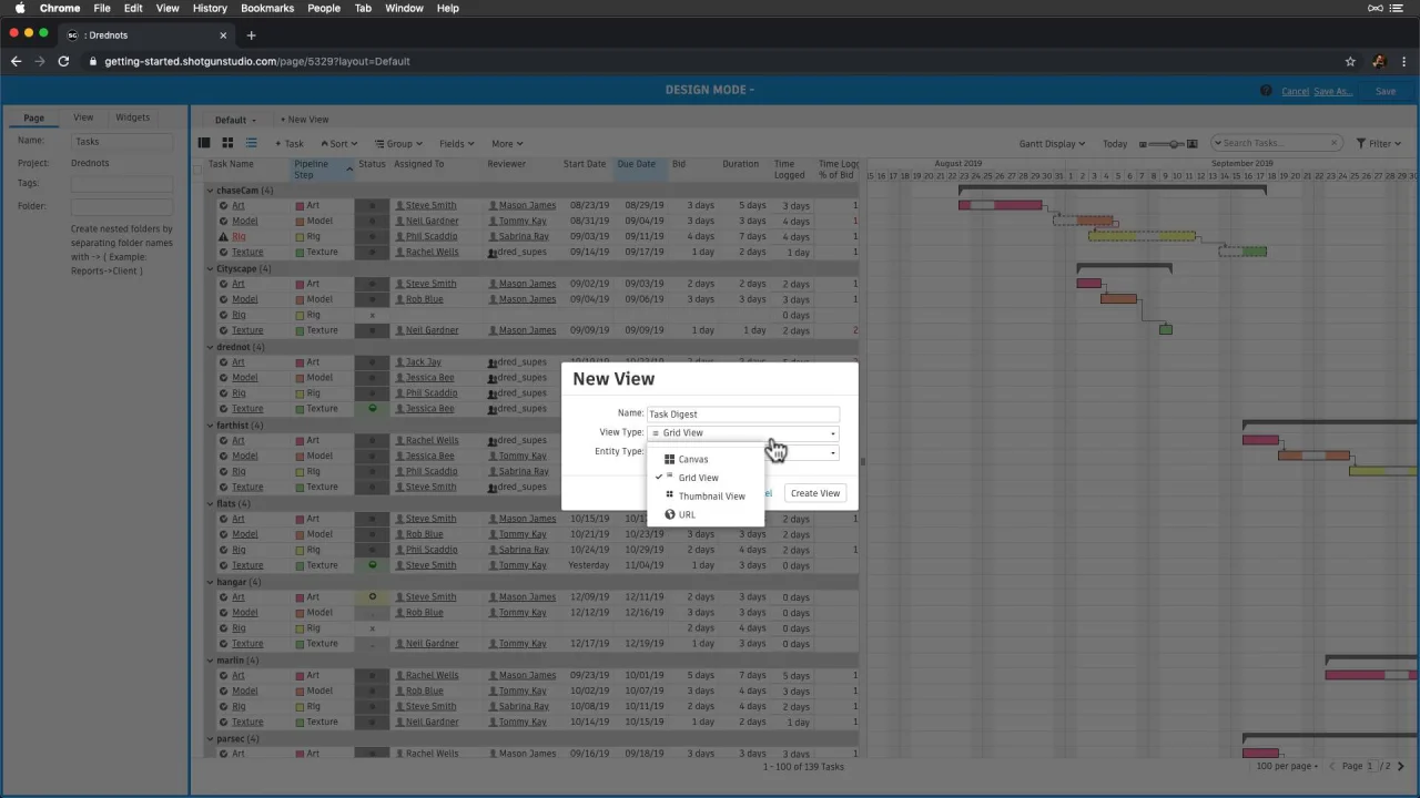
First, let’s design our page and create a New View.
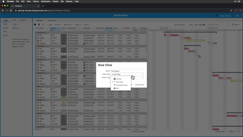
We have a few views to choose from:
- Grid: A view showing us a list of records.
- Thumbnail: A view showing us a more visual view of each record.
- URL: A full page view of any web page.
We’ll choose the Canvas type, which is a page of different widgets that can each display their own type of data. Most pages can have new Views. They give us more flexibility in showing more specific information without having to create a new page—great for department views and showing production insights, like stats. We can also restrict access to views, which we’ll do in this case—restricting to Managers and Admins.

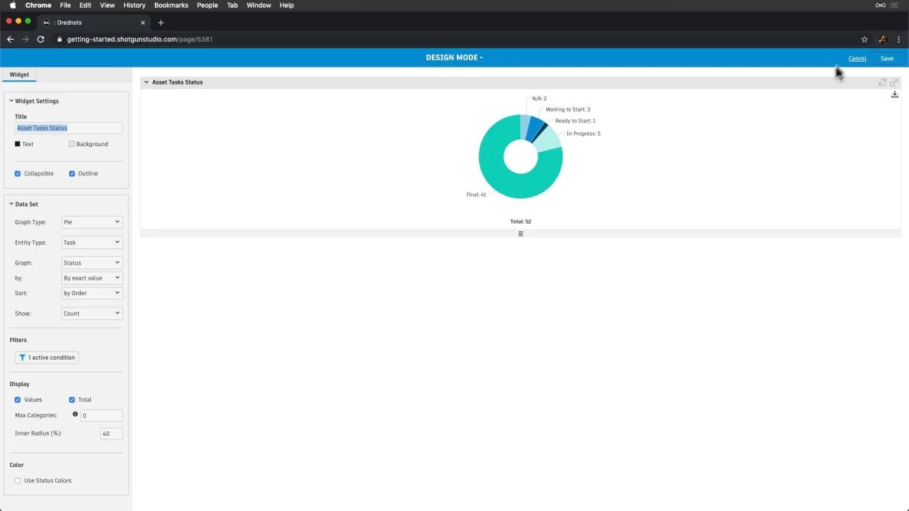
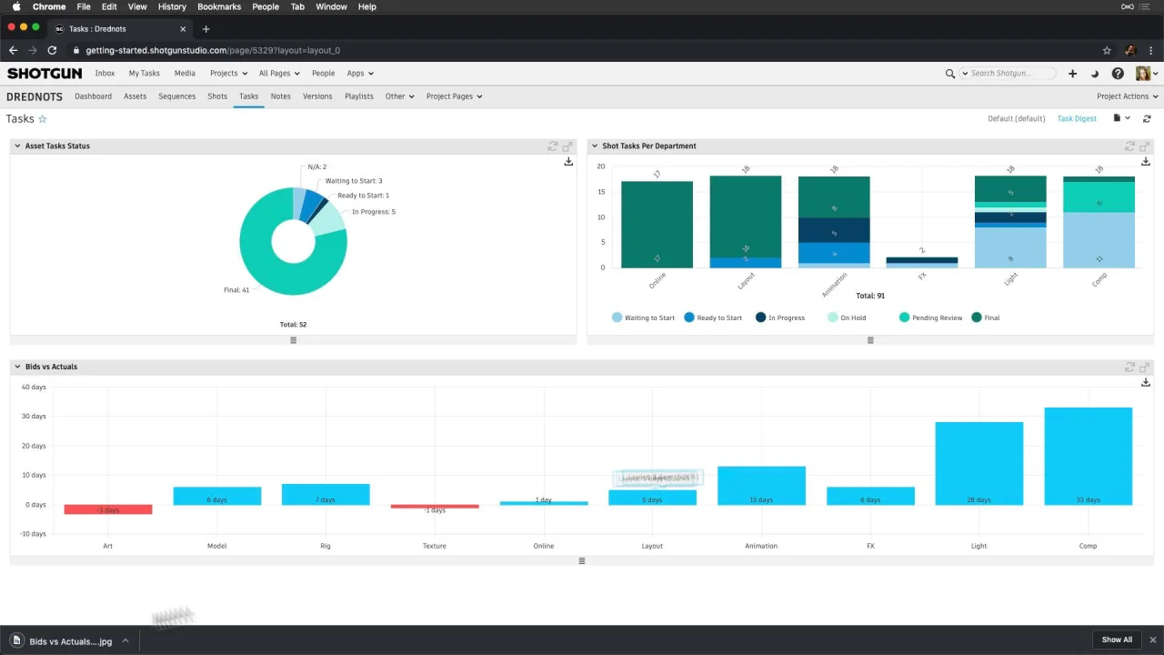
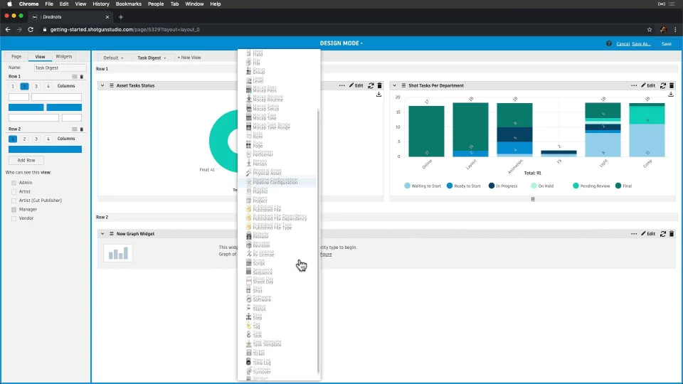
Now, let’s add our first two widgets: the first two pre-configured ones at the bottom:
- Tasks Status, and
- Tasks Per Department
Let’s configure them to show Assets and Shots, and use these as is. Note that pre-configured widgets are also great to use as a base for others. These will set the context for the next graph we create on bids versus actuals.

Now, let’s:
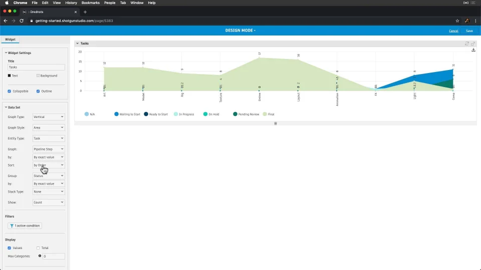
- add the graph widget to our canvas,
- adjust the layout a little,
- then configure it to show Tasks,
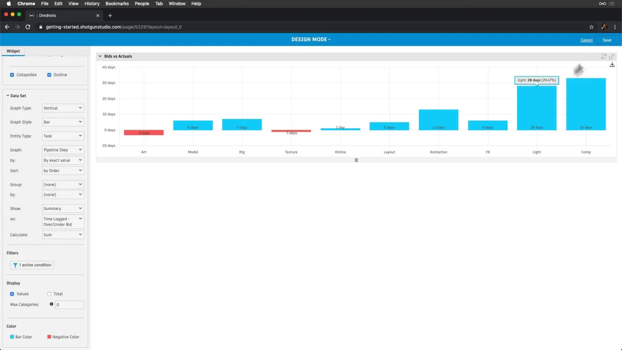
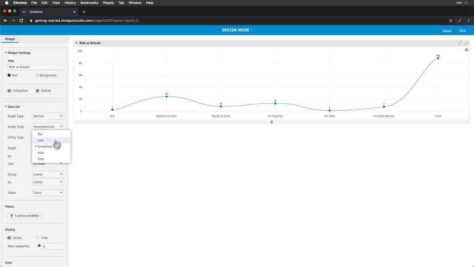
- and name the widget “Bids vs. Actuals”.
Next, let’s configure our data set. We like the Vertical graph type, but let’s make note of the others.
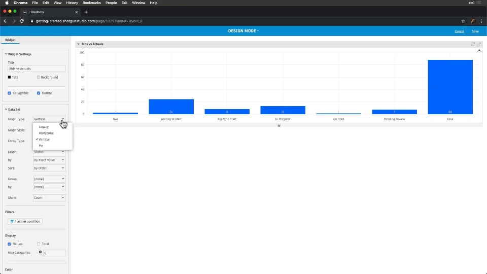
For the graph style, bars make the most sense here, but we also have these other options.
Let’s:
- graph by Pipeline Step,
- summarize by “Time Logged - Over/Under Bid”,
- calculate the sum,
- adjust the colors to our liking,
- and save the widget so we can see where we are under/over once Artists start logging their time.

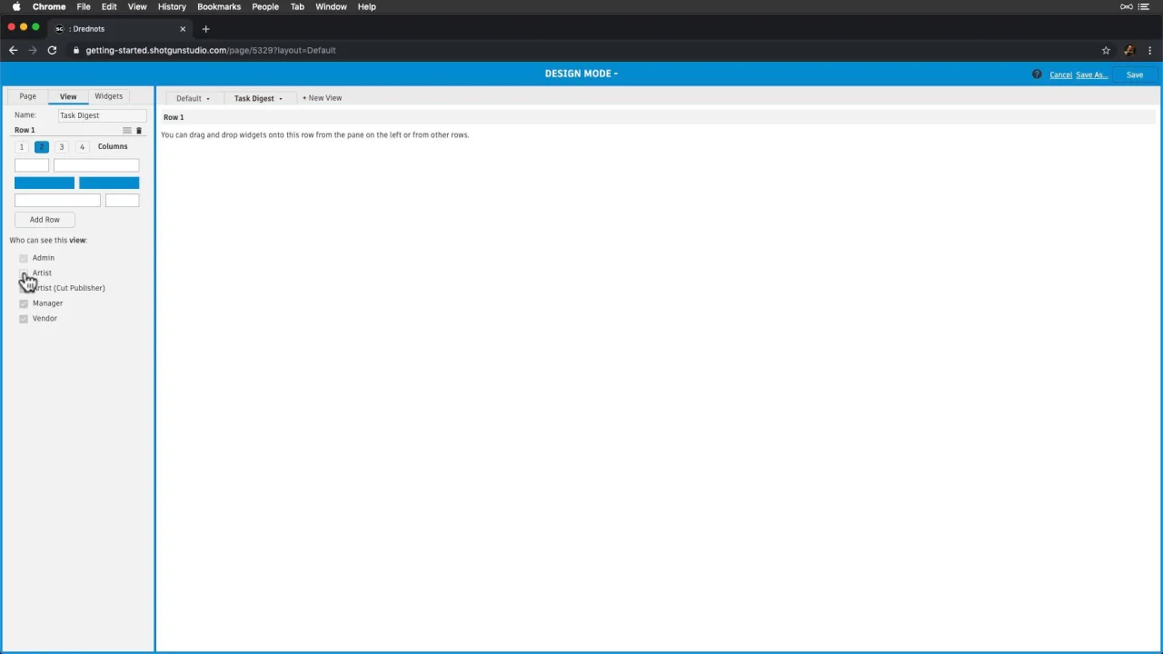
Note that we’re still in Design Page mode, and need to save the page to commit this new view. Let’s make the Schedule View the default view first so it’s the view our team will see when visiting this page, and then save.
Now let’s share with our team of Producers. We can pass along a direct link to the “Bids vs. Actuals” view by selecting that view and then copying the URL link. We can also:
- export graphs as images,
- export the data,
- and even print to share with anyone.
Each of these graphs is interactive, so we can drill in to see more detail when we need to.

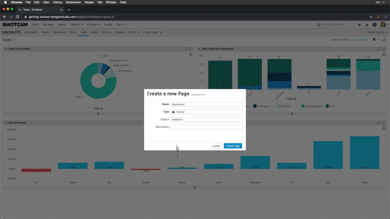
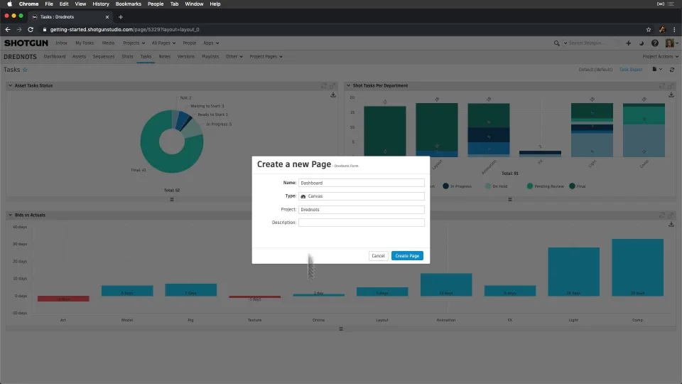
Now that we’ve created a pretty cool view for Producers, let’s create a dashboard for the team, and promote it to our Project Nav bar so it’s the first thing everyone sees. This will give everyone a higher level glance at our project as a whole, and all the progress we’re making.
Let’s start by creating a new page, and call it “Dashboard”. Again, let’s make this page a canvas type, and enter design page mode to add a hand full of widgets.
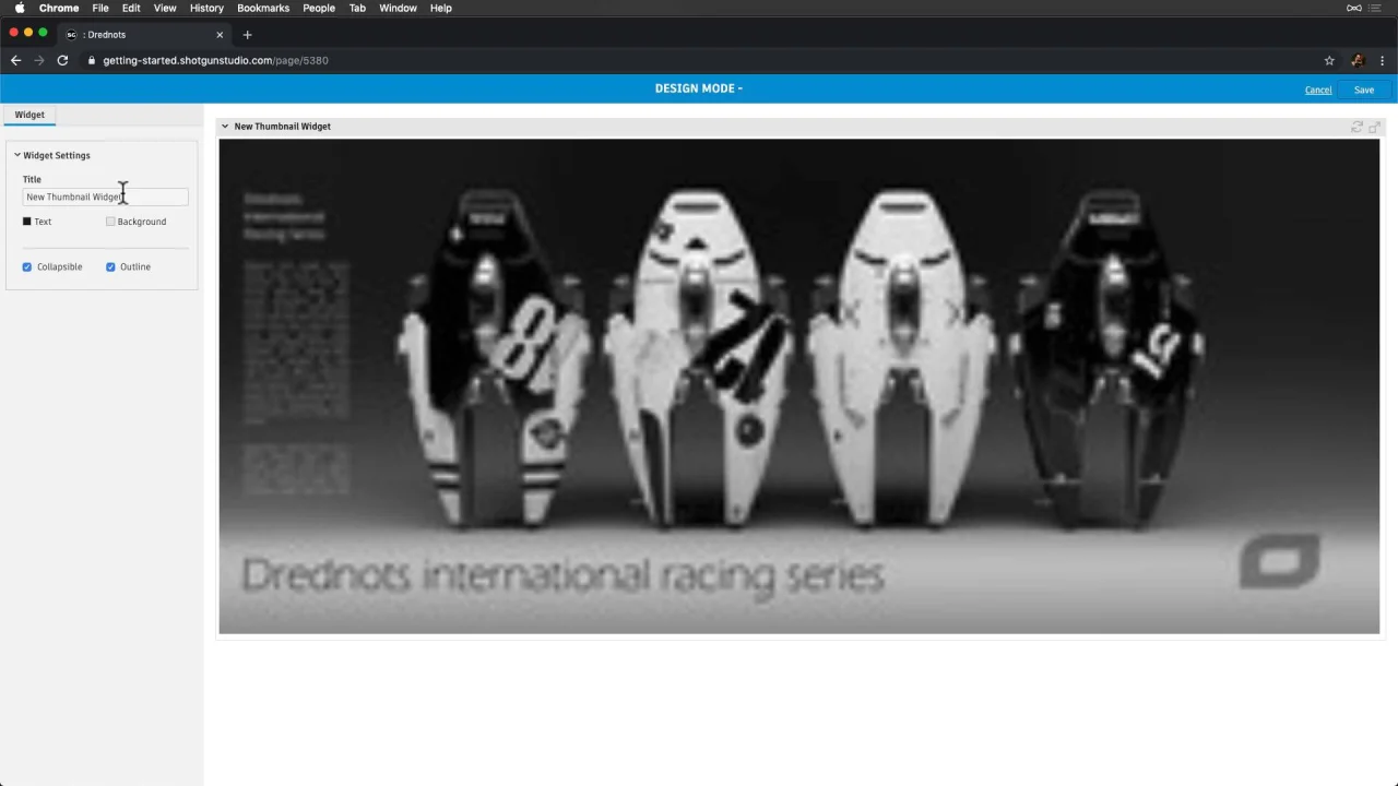
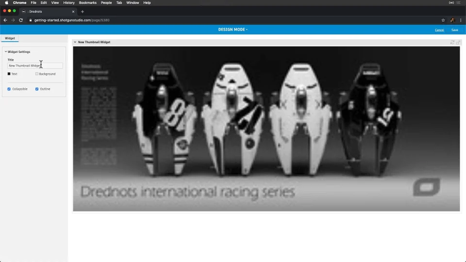
First, let’s add a visual representation of our Drednots project, by adding a thumbnail widget. This will display the main thumbnail associated with the current Project.
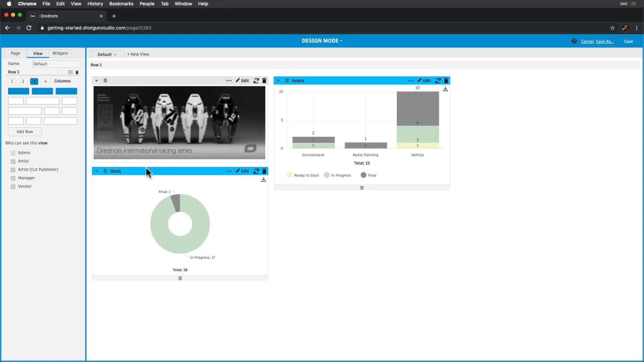
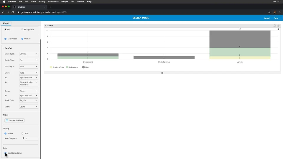
Now, let’s show progress on our Assets, by adding a Graph widget, graphing by Type, alphabetically, then grouping by Status and adjusting the stack.
Next, let’s select “Use Status Colors” so that the status colors are consistent with what the team sees across our site.
Then, let’s display totals since it’s nice to see the total count at the bottom of the graph, adjust the top bar color, and save the widget.
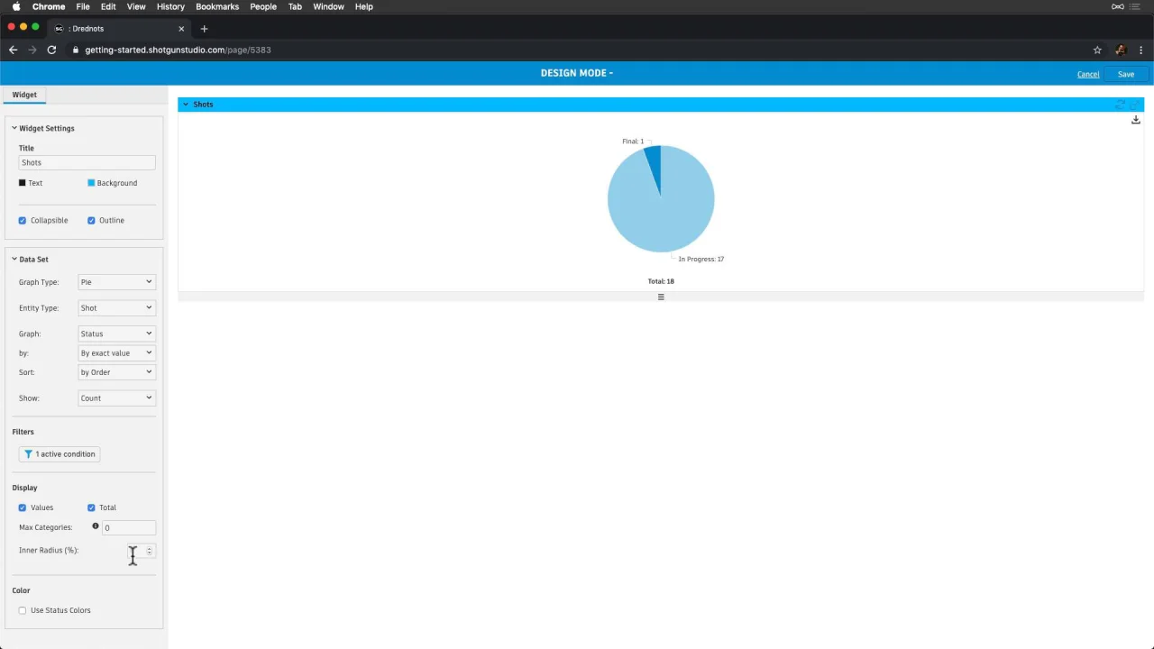
Let’s graph something similar for Shots, but make it a pie graph this time. With pie graphs, we can also adjust the Inner Radius (%). Let’s apply 40% here.

This is looking pretty good—let’s take a moment to adjust the view so that we have three widgets evenly dispersed in our first row.

Now we’re thinking it would be awesome to add a countdown to project completion. Let’s face it—we love celebrations and this will help motivate us towards that one big milestone. And, why don’t we add all of the people in our project we’ll celebrate with!
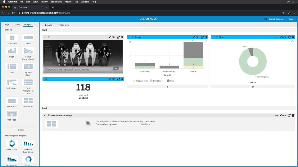
Now, let’s show progress on Tasks by adding an Area Style Graph. Let’s also graph by Pipeline Step, and then group by Status. Neat how we can show our team how things flow through our pipeline, and have this kind of transparency with them.
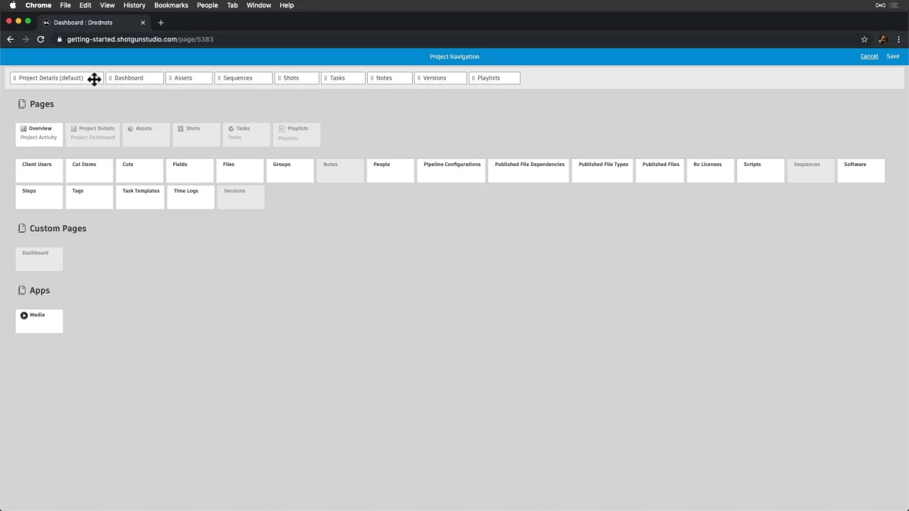
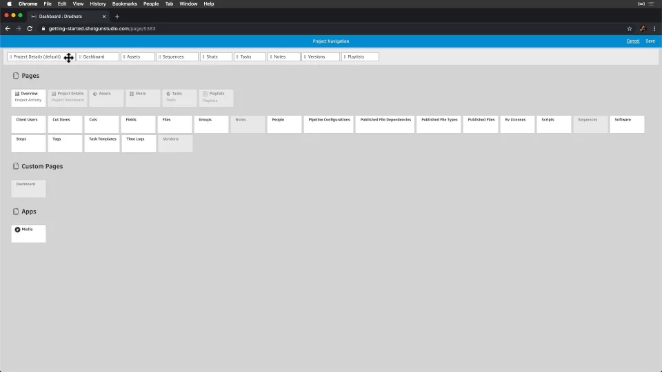
To wrap this up, let’s promote this page so that everyone sees it when they visit our Project. Let’s select “Add to Navigation” from page settings, and then rearrange and remove Project Details, replacing that first page with our new “Dashboard” page. Now, we’re all set, and our global team is equipped with important knowledge about our project.
Analyze and Optimize Page Performance on Grid Pages
To investigate, troubleshoot and optimize page performance, you can use the Analyze Page Performance tool on grid pages. Learn more about this tool here.