About Property Panels
Property Panels provide contextual access to parameters used for creating and editing features.
The property panel floats above the graphic area and, initially, appears in the upper left of the graphics area. Panels can be resized, combined with the Model browser, moved to another location, and even to a secondary monitor. Property Panels use parameter groups with an accordion control instead of tabs.
Key Concepts
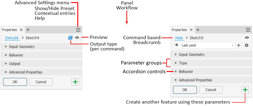
Workflow - the property panel workflow is from top to bottom. Any property you set or change can affect the properties in sections below it. A property does not affect the properties in preceding sections.
 Orange dots - these appear when Inventor is newly installed. They highlight seldom used settings, command and feature productivity options, and new command options. Display options are located in the Get Started
  New Features panel, click Highlight New. See To Work with New and Updated Badges.
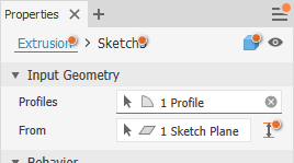
Breadcrumb - quickly switch from editing the feature to editing the associated sketch. Rename the feature or sketch right from the breadcrumb.
Preview - located to the right of the breadcrumb, Preview toggles the feature preview visibility when editing the feature or sketch. During sketch editing, selected regions or loops preview in wireframe. Toggle the option to hide the preview.
Note: Some property panels do not use the preview toggle.Presets - use presets to create reusable feature definitions. For more on Presets, see To Work with Presets.
Value edits - shortcut keys to navigate the panel, colored text alerts to value health:
- Enter - apply value edits
- Ctrl + Enter - end the feature definition, create the feature, and close the property panel
- Tab - move progressively to the next field
- Shift + Tab - move recursively to the previous field
- Ctrl+ Down - accesses the RVEC Flyout menu
- Up/Down keys - move up and down combo list controls
- Text color - invalid values are red, valid values are black
Accordion control - parameter groups can be expanded to expose parameters for editing or collapsed to hide seldom used parameters.
Advanced Settings menu - the drop down provides access to Show/Hide Preset, Help and other advanced settings. The menu adjusts based on context. For example, when creating or editing a feature, the menu list contains options related only to the feature being edited. When working in the browser, the panel menu is according to the model browser state, and so on.
Edit fields cross-highlight between the property panel and the in-canvas edit controls. This default behavior can be overridden by using the Advanced Settings option Single ENTER to finish command.
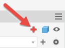
 Apply and create new - click to create the feature using the current settings and begin creating another feature using the same settings. You can change any settings, as needed, then create another feature.
Docking - the property panel and its tool palette can be docked in any Inventor application graphics window, within the browser space, or remain floating whether over the application or somewhere on the desktop. This allows you to position the panel or browser wherever it is convenient for you. When docking the panel to a window frame, the target frame edge highlights to confirm where the docking will occur. The next time the command is initiated, it starts in the docked location. If the window was closed prior to initiating the command, the property panel docks to the main app window.
Display - panels remember their most recent display state and use that when next visited.
Tool Palette
Some commands include a tool palette. Tool palettes expose options useful for the command during its operation. Tool palettes are docked to the property panel by default.
- Click-drag the palette away from the property panel to separate it.
- Click-drag the palette next to the property panel, when you see the space between the two highlight, drop the palette.
- Palettes dock to either side of the property panel.
Understanding the Property Panel user interface
These are some of the behaviors you will see in the property panel.
Profile problems - when a profile issue occurs, the Sketch Doctor icon appears in the property panel alerting you to the issue. Click the icon to start Sketch Doctor or manually resolve the issue.
Input
When a value is needed for a feature to be ready to create, the field displays in red text and an alert icon to the right.
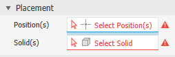
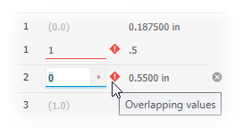
Warning notifications display as an exclamation mark inside a red diamond shape. These notifications alert you to blocking conditions such as conflicting inputs, an error condition, or an issue preventing successful feature creation. If the issues are in a table and the control is collapsed, the notification is added to the group node.
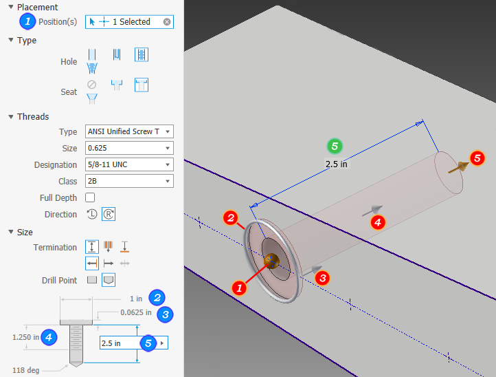
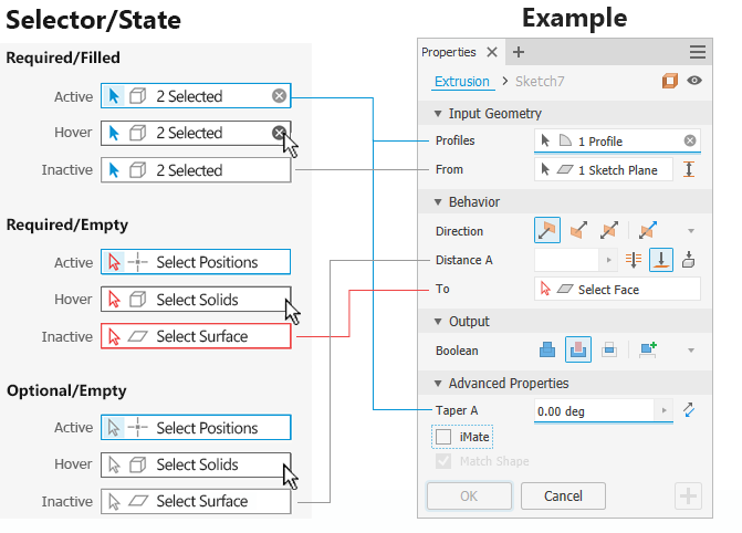
When more than one selection is required and satisfied, each field has a colored dot that corresponds to the selection highlight in the graphics window. The active selector field is underlined.
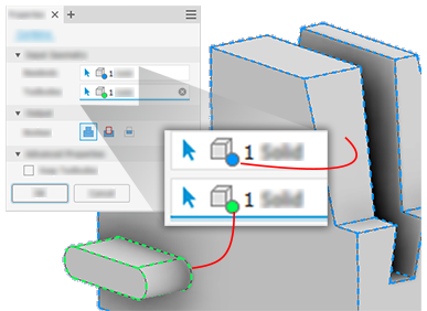
Some commands support multiple selection sets which supports multiple sizes within the same feature operation. When multiple selection sets are available, each set can be assigned a different size value.
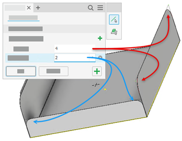
To add a selection set, click
 Add corner edge set, at the right of Selection Sets, to start a new selection set.
Select all edges that you want at the specified value for the feature. Add a new selection set for a different size within the same feature.
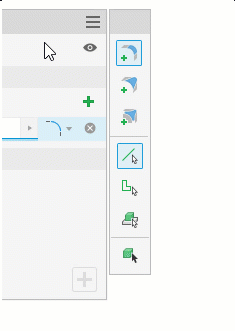
Icons or list - some icon groups have the option to be displayed in dropdown list form. Click the arrow to the right of the field to select the options. When displayed as a list, you can use keyboard entry (the first character of the word) to choose an option.
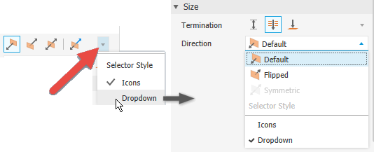 Note: In list mode, the list updates as you roll the mouse wheel.
Edit field behaviors
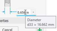
Hover: when the cursor is over the edit field it highlights with a white background and a colored underline to show that you are actively editing a value. A tooltip displays when the cursor hovers over the edit field.
Single click: selects the complete field, value and units.
Second click: deselects the field and places the insertion cursor at the selected character.
Click+drag: selects characters included in the action from mouse down to mouse up.
Double click: selects a set of characters that is bounded by a space, comma, or special character. Examples are units, values, and parameters.
Triple click: selects the complete field, the same as single click.
After selecting a feature dimension, the cursor stays at the end of the field. Supporting easier formula or equation creation.
Table Control behavior
Some property panel commands use tables to display input, such as the Fillet command. These are the ways to interact with the table content.
Where headers are clickable, you can sort the contents.
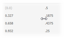
Pause the cursor to the left of the value fields and click-drag to resize the value column.
Tab to progressively go through the fields. Use Shift+tab to reverse direction through the fields.
When a field that you want to edit highlights, right or left arrow keys drop you into the value edit mode.
Use Ctrl+Delete to delete a row in the table element.
Note: Some rows, such as the start and end points for variable fillets, can't be deleted, but all interim rows can be deleted.
Breadcrumbs
Breadcrumbs horizontally display the current or active location in the document hierarchy. They can provide access to documents, features, and sketches depending on document type.
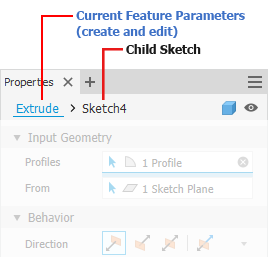
Typically, the property panel begins in the feature definition mode. You can click the breadcrumb text to switch environments, from Feature to Sketch and back again. The breadcrumb text for the selected environment displays in blue.
You can also use the Return to Feature  command in the ribbon to switch from sketch editing back to feature editing. The icon displays the active feature being created or edited, such as Extrude, Revolve, and so on.
Switching environments causes the current environment to commit any changes made before the switch occurs. Thus, switching to Sketch from Feature will create the defined feature before the environment changes. Switching back from Sketch to Feature causes any sketch geometry changes to be accepted before the environment change. The property panel fields update with the environment change.
You can edit the Feature or Sketch name by means of the breadcrumb.
- Click the breadcrumb text you want to edit to activate it.
- Click again to enter edit mode.
- Modify the text.
- Press Enter to complete the change. The browser node name is updated when you click OK to complete the feature.
Advanced Settings Menu
The Property panel menu contains settings related to the active create or edit command context and the document type. The menu entries are contextual, they display only options the command can use. Some advanced settings override default behaviors. In some cases, these settings are On by default. Select the menu entry to turn the option ON/OFF.
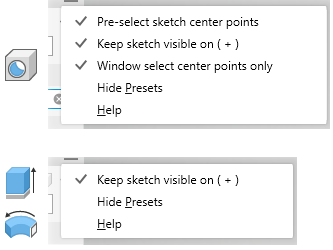
The property panel state for these settings is retained between sessions. Thus, if you turn one off, and later want to use it, you will need to turn it back on.
Property Panel Navigation
Tab key
You can tab from one field to another, whether in the property panel or canvas. When you tab in-canvas, the tabs are for the displayed parameters. When you tab in the property panel, tabbing occurs for those parameters listed in the panel. Cross-highlighting occurs for the related fields.
Character key
When in a dropdown list, use the character key to quickly search for and locate a list entry.
Property Panel and In-canvas Editing
When creating or editing features you can use the edit fields in the Property panel, the in-canvas edit fields, or the feature manipulators to modify values.
The following example uses the Hole feature to illustrate the various parameter value access points.
The default behavior for the property panel and in-canvas edit controls allows you to use keyboard entry. When editing a value input the following applies:
When the property panel has focus or a value in an edit control is highlighted, Enter completes the feature definition the same as clicking OK, and closes the property panel.
When a value edit control has focus and you are actively modifying a value, the Enter key affects only the value.
When a selector field is unfulfilled and there is no active HUD control, ENTER acts like Continue, and moves the focus to the unfulfilled field. To deactivate a HUD control, click in a blank area of the display.
When a value edit control has focus you can complete the feature definition process and close the property panel by using CTRL+Enter. You can also use ENTER twice to achieve the same result.
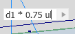
When using the context menu of a value edit control, after adding the value selection, the cursor moves to the end of the control, clearing the selection. This aids with making use of feature dimensions and applying factors to those values.
The legacy ENTER behavior can be recovered as mentioned above in Advanced Settings Menu section.
Selector States
The property panel selectors display their states using colors. Click in a selector field to activate it. The following image shows the states and ties them to an example.
Clearing Selections
When a selection is made, the selector field displays the number of items selected and an 'X' at the right end of the field. To clear the selection set, click the 'X', then, make your next selections.
Marking Menu
If the required inputs are not satisfied, the marking menu displays either a disabled OK button or a Continue button in the 3 o'clock position to alert you of the need to complete the definition.
Undo Behavior
Undo has a slightly different behavior when the command is displaying a property panel or dialog. Here's how it works:
- In an active command and a dialog or property panel is displayed: Undo cancels the active command.
- In an active command and no dialog or property panel is displayed: Undo cancels the active command and undoes one step.
- Not in an active command: Undo undoes one step.
Advanced Properties
This section populates with the more specialized options based on the feature type being created.