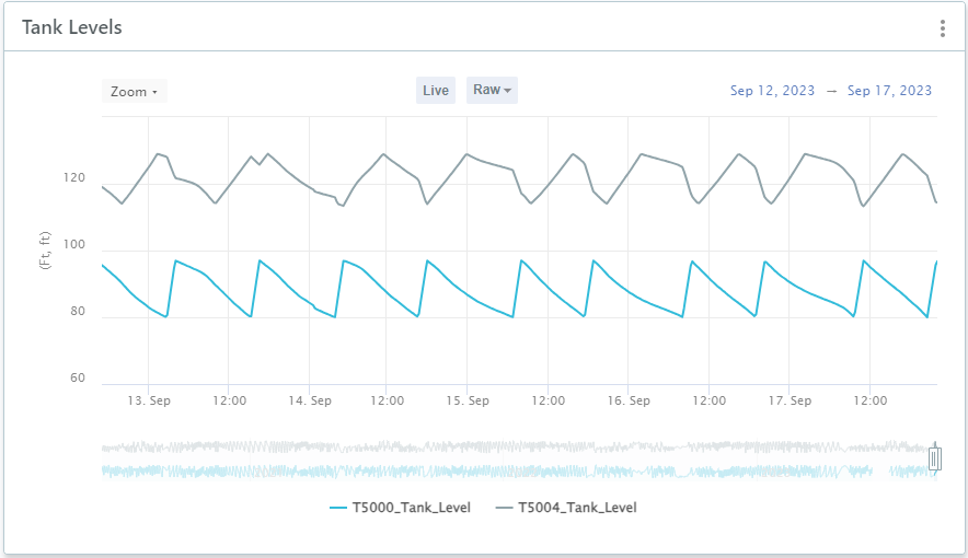
Create a historical chart to show trends and behavior over time.
For example, you may want to see trends in how tank levels fluctuate over time.

To create a historical chart
- In your workspace, choose Add Component
 Historical Chart.
- Fill out the fields in the Historical Chart form.
- Sensor: Choose between Individual sensors or a Sensor group.
- Data Source: Select a data source. If you selected Individual, you can add more than one.
To add model simulation results to a historical chart, for example to compare these to an observed SCADA data set, see Create a Model Simulation Workspace.
- Time Range: If you want to show a specific time period in your chart, turn this on and then select the specific dates or how many days to go back (time offset). You can change the dates easily on the chart.
- Chart name: This defaults to the name of the first data source you select, but you can change it.
- Description: Enter a description of your chart.
- Resolution: Choose the default interval for the chart. There is a drop-down on the final chart to change between intervals.
- Function: Choose from the drop-down list.
Average The mean value of the data points in the selected resolution interval. Close Final value in the selected resolution interval. For example, if you set the resolution to hourly, the chart will show the final value for each hour.
High Highest value in the selected resolution interval. For example, if you set the resolution to daily, the chart will show the highest reading for each day.
Last Outputs the most recent valid data point. This function is used to extend through gaps in data. Low Lowest value in the selected resolution interval. Moving Average Sums the values of the last period N then divides this by N. N = 'Number of Periods'. For example, if you set the resolution interval to 15 minutes and the number of periods to 24, the calculation will use the 24 values collected in the last 6 hours.
Moving Sum Sums the values of the last period N. N = 'Number of Periods'. For example, if you set the resolution interval to 15 minutes and the number of periods to 4, you will get the sum for the last hour.
Open First value in the selected resolution interval. Square Root Gives the square root of the data point. This is calculated using the average value for the select resolution interval. Sum The sum of all the data points collected in the selected resolution interval. For example, if the sensor data is collected every 5 minutes and the resolution is set to hourly, this will be the sum of the 12 values collected in the hour. The sum function is particularly useful when looking at volume sensors.
- Type: Choose a chart type.
- Line: Shows a series of data points connected with a straight line.
- Smooth Line: Curved lines are drawn between the data points in the series.
- Bar: Shows data as vertical bars.
- Area: Same as a line chart only the area between the line and the threshold is filled in.
- Smooth Area: The smooth area chart is the same as Area, only the line is a smooth line instead of straight lines.
- Point: Shows scattered data points without connecting them.
- Candlestick: Shows the Open, High, Low and Close values for the selected time window.
- Click Submit.
- Choose if you want to turn the Live button on (green) so that the chart gets updated with the latest data any time it is refreshed. Or, if you want to keep specific dates set for a historical chart, leave this off.
Note: For the Live button to be on, the chart end date must be set to today. Moving the end date either via the slider or the date picker will deactivate the Live button.
You can also add historical charts to a workspace from the map:
- On the map, select a sensor and then click on the three dots
 .
.
- Click Add chart to Workspace and then select the workspace.
- Click Add to Workspace.
You can then navigate to the workspace and configure as described above.