
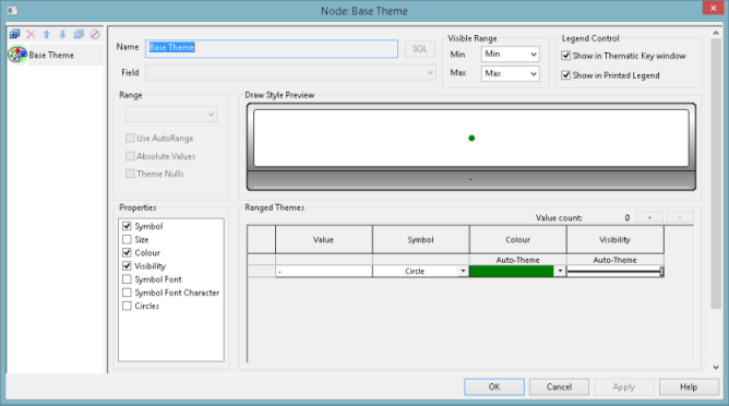
The Layer Theme Editor is displayed when the Edit button of the Theme column is clicked for a network object type on the GeoPlan Properties - Layers and Themes Page.
This topic describes the Layer Theme Editor, which is the dialog used to set up themes. Refer to the Managing Themes topic for more information on how to create, edit or delete GeoPlan themes.
The Layer Theme Editor allows you to change the display options for themes and contour plots for every network object and ground model on the GeoPlan Window. It consists of:
- the Sub Theme Manager Pane on the left side
- the Sub Theme Editor Pane on the right side
Every layer (object type or ground model) can have an ordered set of themes and a default theme.
A default theme, or Base Theme, is provided for each network object or ground model. It is always the last theme in the list box in the event of there being several themes for the same layer. Some additional themes may be provided for some specific layers.
Users can create other themes, also known as Sub Themes, by using the Sub Theme Editor Pane toolbar.
Sub Theme Manager Pane
Themes names/types are displayed in a list box inside the Sub Theme Manager Pane.
The current theme, whose settings are currently displayed in the Sub Theme Editor Pane is identified by the green background on the painter's palette image in front of its name.
When you start InfoAsset Manager for the first time, every layer has at least one Base Theme.
The Sub Theme Manager Pane toolbar allows you to manage themes.
|
Button |
Description |
|---|---|
|
Add |
Add new sub theme. This displays a blank Sub Theme Editor Pane. Enter a name for the new sub-theme and specify the desired settings. |
|
Delete |
Deletes the current sub theme. Clicking on this button brings up a confirmation message . Click on Yes to confirm permanent deletion of the sub theme or click on No to cancel. |
|
Move Up |
Promotes the current sub theme. Clicking on this button raises the selected sub theme to the next level. You can click on this button several times to bring the sub theme up one level per click. |
|
Move Down |
Demotes the current sub-theme. Clicking on this button lowers the selected sub theme to the next level. You can click on this button several times to bring the sub theme down one level per click. |
|
Duplicate |
Copies the current sub theme. Clicking on this button creates a copy of the currently selected sub theme. The sub theme editor pane will contain the same settings as the copied sub-theme. |

|
Enables / disables the current sub theme. Clicking on this button shows / hides the theme so that it is / it is not displayed on the GeoPlan Window or on the Thematic Key Window . When a sub theme is disabled, its icon is greyed out with the disable icon displayed on top. Click the button again to enable (show) the theme. |


Important note about theme precedence
The order in which sub themes appear in the Sub Theme Manager Pane determines the order in which they are applied to the Geoplan. Please refer to the Theme Precedence topic for further details.
Sub Theme Editor Pane
Settings for the currently selected theme appear on the sub theme editor pane.
|
Name |
Name of the current theme. |
|
Field |
The field name in the dropdown list is the name in the database. If the field selected is a choice list field (value selected from a dropdown list in the property sheet or grid view e.g. node type), the option to only show choices will be displayed. Please refer to the Creating a New Sub-Theme section of the Managing Themes topic for further details. The list will also contain any SQL expressions previously added using the Edit SQL functionality described below. |
|
SQL |
Use the SQL button to add and edit SQL expressions. The Expression dialog (a simplified version of the SQL Dialog - SQL Page) will be displayed. Select parameters using the Field Type and Field dropdown of the Expression Page. Added SQL expressions will become available in the Field name dropdown list (see above). Use the Display precision dropdown box to select the number of decimal places to be shown when displaying SQL expression results in labels. You can use SQL expressions that return non-numeric results such as text strings and date types, and then theme on their results. For example, if there are some nodes with a system type of "other" and you use a user defined field, such as user text 1, for providing more information about them, then, if you want to highlight the nodes in the network that have this additional information, you can use the expression: iif (user_text_1 IS NULL, system_type, user_text_1) to select the applicable nodes, and then set the sub-theme parameters to show the applicable nodes in the network. Similarly, if you wanted to use a sub-theme to highlight abandoned pipes in the network but highlight the other pipes based on their system type, you can add the expression, iif(status="AB", "Abandoned", system_type), and then set the theme parameters as required. Note that theming using SQL expressions may not work as expected under the following circumstances:
In either of the above cases, it may be impossible to correctly identify the return type of the SQL expression and values may be converted using a different rule than you expected (e.g. all string values become zero). |
|
Visible Range |
A visible range over which the theme is applied should be set. Depending on the visibility control type set in the General page of the Options dialog, the min and max will be zoom or scale levels. For each, select an existing level from the drop-down list or type in a new level. If you type in a new value, the software behaviour (exact new level, closest higher level, or closest lower level picked) will rely on the settings set in the Zoom/ Scale section of the Options - General page. |
|
Legend Control |
Controls whether the current theme is to be shown in the Thematic Key Window and printed legend. |
|
Range |
The most valid range settings for your previous selections are selected by default. You can select the range settings you require if the default ones are not suitable. Range Settings are: Continuous. Displays objects differently based on a series of ranges of a parameter. Suitable for parameters with continually variable values, such as depth or flow. Individual. Displays objects differently based on individual values (rather than ranged values) of a parameter. Suitable for parameters with a small number of discrete values. Flag. This is a special case of the Individual settings where the discrete value being displayed is the data flag. Use AutoRange - With this option checked, InfoAsset Manager automatically re-scales the values if you open a different network. Relative Palette - InfoAsset Manager will apply the selected set of colours in the Ranged Themes Grid to the area currently being viewed on the GeoPlan. Values are automatically re-scaled when the GeoPlan zoom is changed. (Applies to Flood, Ground Model and Rainfall themes.) Absolute Values - Removes any sign and simply uses the absolute value of the parameter. Theme Nulls - Allows the user to set up a theme for field values that have not been explicitly assigned (NULL values). Ticking this box :
Tip: A #NULL value is a value that has not been explicitly assigned (nothing has been set in the corresponding dropdown list), and is distinctively different from a
#NOT
value.
|
|
Draw Style Preview |
Displays a preview of the current theme for the permitted values detailed in the Value column of the Ranged Themes grid. If not all of the permitted values are shown in the preview section due to lack of space, the preview area will be outlined with dashed lines. A cumulative frequency histogram of the theme ranges is displayed at the bottom of the preview. This may be used in conjunction with the Ranged Themes AutoScale functionality in order to select a suitable distribution. |
|
Properties |
Specifies the theme properties that are shown and customisable in the Ranged Themes grid. Property check boxes that are ticked in the Properties box will have a corresponding column in the Ranged Themes grid. Select the desired properties for your theme. |
|
Ranged Themes |
|
 ) - respectively add or remove values within the range; hold the button down to add or remove multiple values. The number of ranges is displayed next to the buttons. When values are added, these are calculated according to the distribution type that has been selected (see below).
The following sections detail all the available attributes for a variety of themes:
Point / Node theme attributes
|
Attribute |
Description |
|---|---|
|
Symbol |
Check the box to use a symbol other than the default setting (circle). Select the desired symbol for each value in the corresponding dropdown list. |
|
Symbol size |
Check the box to use a symbol size other than the default setting (60). Select the desired size for each value in the corresponding dropdown list. |
|
Symbol colour |
Check the box to use a symbol colour other than the default setting (black). Select the desired colour for each value in the corresponding dropdown list. |
|
Symbol visibility (%) |
Check the box to use a visibility other than the default one (100%) for the symbol. Use the slider to control the symbol visibility for each value (Slider at the left end indicates 0% visibility whilst slider at the right end means 100% visibility). |
|
Circles |
Check the box to use circles in the theme. Select the desired number of concentric circles for each value in the corresponding dropdown list. |
|
Symbol font |
Check the box to use a font other than the default one (Ariel) for the character symbols. Select the desired font for each value from the dropdown list in the Choose Symbol dialog. |
| Symbol font character |
Check the box to use symbol characters in the theme. Select the desired character for each value from the chart in the Choose Symbol dialog. Note: When specifying Symbol Font Characters for point objects, to prevent the 'normal' symbol being drawn at the same time as the Symbol Font Character, ensure that the Symbol box is checked, and that the symbol value is set to None.
|
Line /Pipe theme attributes
|
Attribute |
Description |
|---|---|
|
Symbol |
Check the box to use a symbol other than the default setting (None). Select the desired symbol for each value in the corresponding dropdown list. |
|
Symbol size |
Check the box to use a symbol size other than the default setting (60). Select the desired size for each value in the corresponding dropdown list. |
|
Symbol colour |
Check the box to use a symbol colour other than the default setting (black). Select the desired colour for each value in the corresponding dropdown list. |
|
Symbol visibility (%) |
Check the box to use a visibility other than the default one (100%) for the symbol. Use the slider to control the symbol visibility for each value (Slider at the left end indicates 0% visibility whilst slider at the right end means 100% visibility). |
|
Symbol font |
Check the box to use a font other than the default one (Ariel) for the character symbols. Select the desired font for each value from the dropdown list in the Choose Symbol dialog. |
| Symbol font character |
Check the box to use symbol characters in the theme. Select the desired character for each value from the chart in the Choose Symbol dialog. |
|
Line Colour |
Check the box to use a line colour other than the default setting (black). Select the desired colour for each value in the corresponding dropdown list. |
|
Line Visibility |
Check the box to use a visibility other than the default one (100%) for the line. Use the slider to control the symbol visibility for each value. |
|
Line Style |
Check the box to use a line style other than the default setting (solid). Select the desired style for each value in the corresponding dropdown list. |
|
Line Width |
Check the box to use a line width other than the default setting (1). Select the desired style for each value in the corresponding dropdown list. |
|
Arrows |
Check the box to use arrows in the theme. Select the desired number of arrows for each value in the corresponding dropdown list. |
|
Arrow Style |
To be used in conjunction with the Arrow property. Check the box to use an arrow style other than the default setting. The default setting for general lines is one arrow and the end arrow style. Select the desired style (-->-- or <--->) for each value in the corresponding dropdown list. Tip: Note that end arrows always point outwards irrespective of the sign on the arrows count. Also, when multiple end arrows are used, the heads work backwards from the line end.
|
Zone theme attributes
|
Attribute |
Description |
|---|---|
|
Symbol |
Check the box to use a symbol other than the default setting (None). Select the desired symbol for each value in the corresponding dropdown list. |
|
Symbol size |
Check the box to use a symbol size other than the default setting (60). Select the desired size for each value in the corresponding dropdown list. |
|
Symbol colour |
Check the box to use a symbol colour other than the default setting (black). Select the desired colour for each value in the corresponding dropdown list. |
|
Symbol visibility (%) |
Check the box to use a visibility other than the default one (100%) for the symbol. Use the slider to control the symbol visibility for each value (Slider at the left end indicates 0% visibility whilst slider at the right end means 100% visibility). |
|
Symbol font |
Check the box to use a font other than the default one (Ariel) for the character symbols. Select the desired font for each value from the dropdown list in the Choose Symbol dialog. |
| Symbol font character |
Check the box to use symbol characters in the theme. Select the desired character for each value from the chart in the Choose Symbol dialog. |
|
Line Colour |
Check the box to use a line colour other than the default setting (black). Select the desired colour for each value in the corresponding dropdown list. |
|
Line Visibility |
Check the box to use a visibility other than the default one (100%) for the line. Use the slider to control the symbol visibility for each value. |
|
Line Style |
Check the box to use a line style other than the default setting (solid). Select the desired style for each value in the corresponding dropdown list. |
|
Line Width |
Check the box to use a line width other than the default setting (1). Select the desired style for each value in the corresponding dropdown list. |
|
Fill Colour |
Check the box to use a fill colour other than the default setting (black). Select the desired colour for each value in the corresponding dropdown list. |
|
Fill Visibility |
Check the box to use a visibility other than the default one (100%) for the fill. Use the slider to control the symbol visibility for each value. |
|
Fill Style |
Check the box to use a fill style other than the default setting (solid). Select the desired style for each value in the corresponding dropdown list. |
2D Zone attributes
For 2D Zones with results, the following attributes can be used in a theme to provide, for example, arrows scaled by speed and oriented by direction.
|
Attribute |
Description |
|---|---|
|
Arrow Length |
Check the box to use an arrow length other than the default setting (100). Select the desired length for each value from the corresponding dropdown list. |
|
Arrow Angle |
Check the box to use an angle for the arrow other than the default setting (0). Use the slider to control the arrow angle for each value. Tip: When using this property with a Direction range setting, a larger the value count will provide a higher degree of accuracy when Autoscaled.
|
Contour theme attributes
|
Attribute |
Description |
|---|---|
|
Fill Colour |
Check the box to use a fill colour other than the default setting (black). Select the desired colour for each value in the corresponding dropdown list. |
|
Fill Style |
Check the box to use a fill style other than the default setting (solid). Select the desired style for each value in the corresponding dropdown list. |
Typical contour themes are ground model themes.
See Displaying a Ground Model on the GeoPlan for more details, as these themes are specialised themes and may have different attributes and sources to the others themes.
Buttons
OK - Closes the dialog and applies changes.
Cancel - Closes the dialog and does not apply any changes.
Apply - Applies changes to the selected theme without closing the dialog.
Help - Opens the related Help topic.