Viewer
Importing a Visual
Power BI uses interactive visualizations to present insights uncovered within your data. The visual specifically allows you to load a Data Exchange model directly from the viewer file included with your dataset. This simplifies access to valuable data by eliminating the need for separate model file management.
Open Power BI Desktop software.
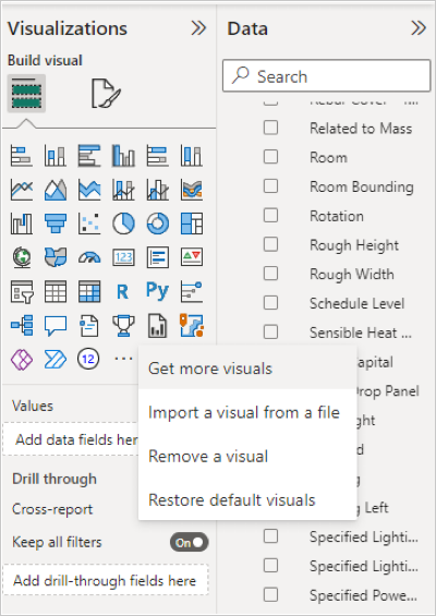
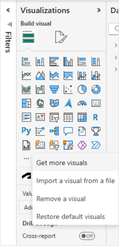
Click More (...) menu in the Power BI desktop Visualizations pane.
Click Import a visual from a file from the drop-down list.
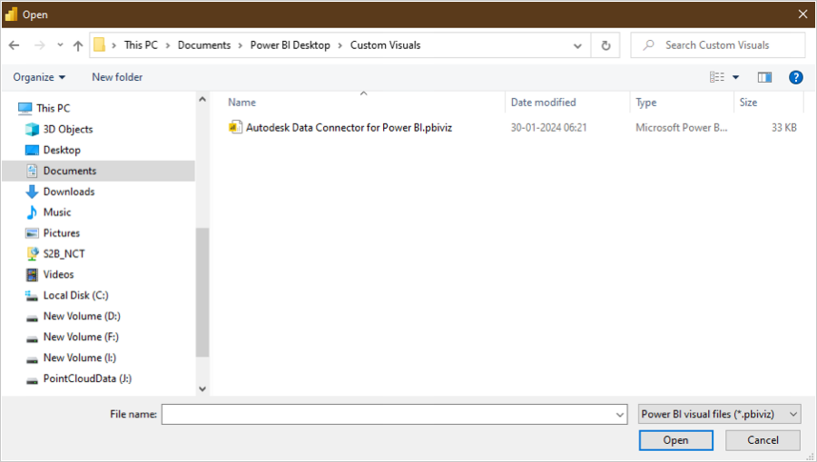
Select C:\Users<UserName>\Documents\Power BI Desktop\Custom Visuals\Autodesk Data Connector for PowerBI.pbiviz and click Open.
After the successful visual import, click OK.
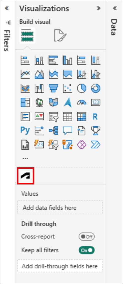
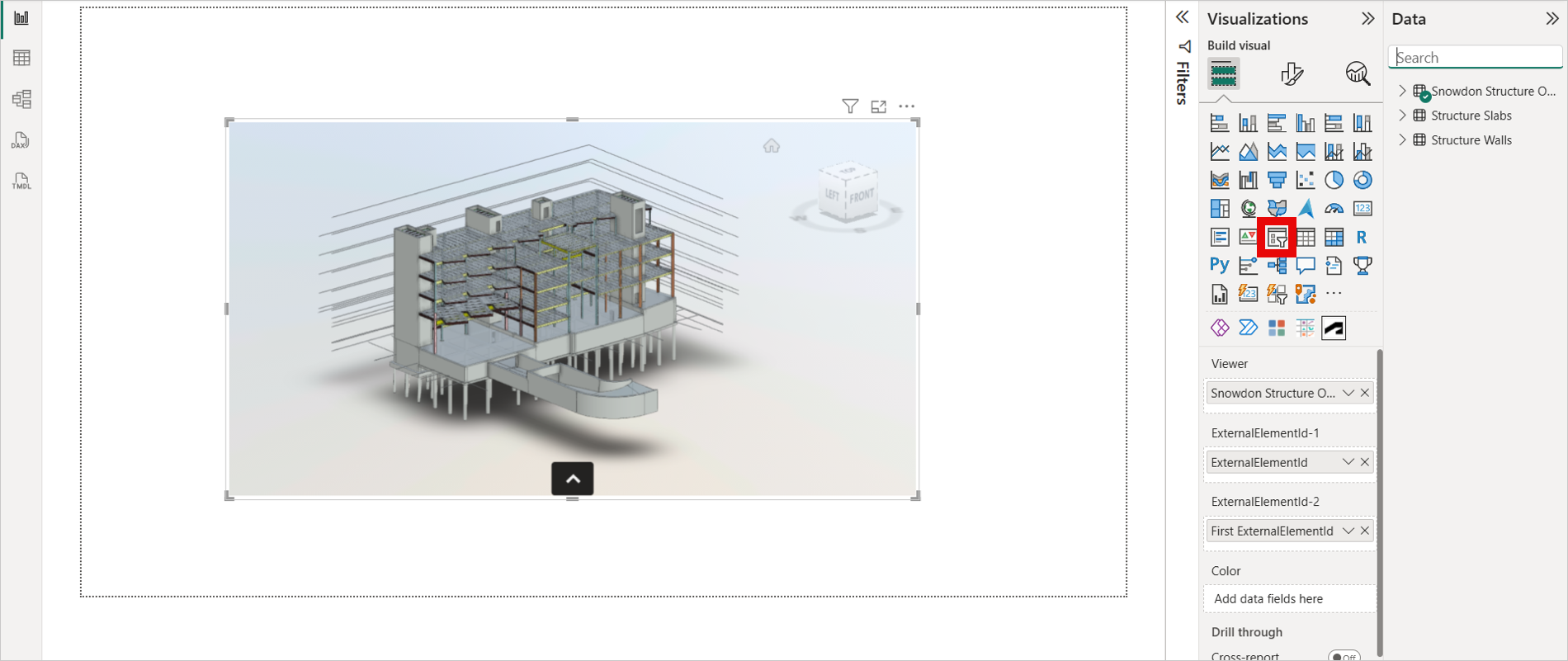
Click the Autodesk Data Connector icon to load the viewer.
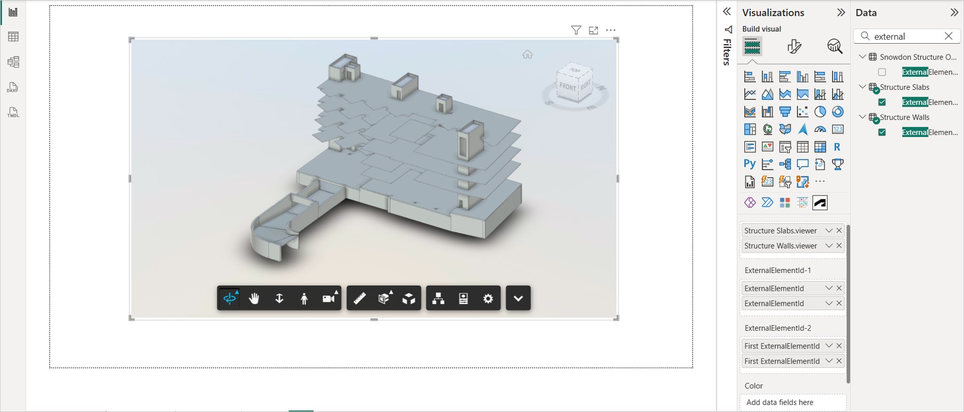
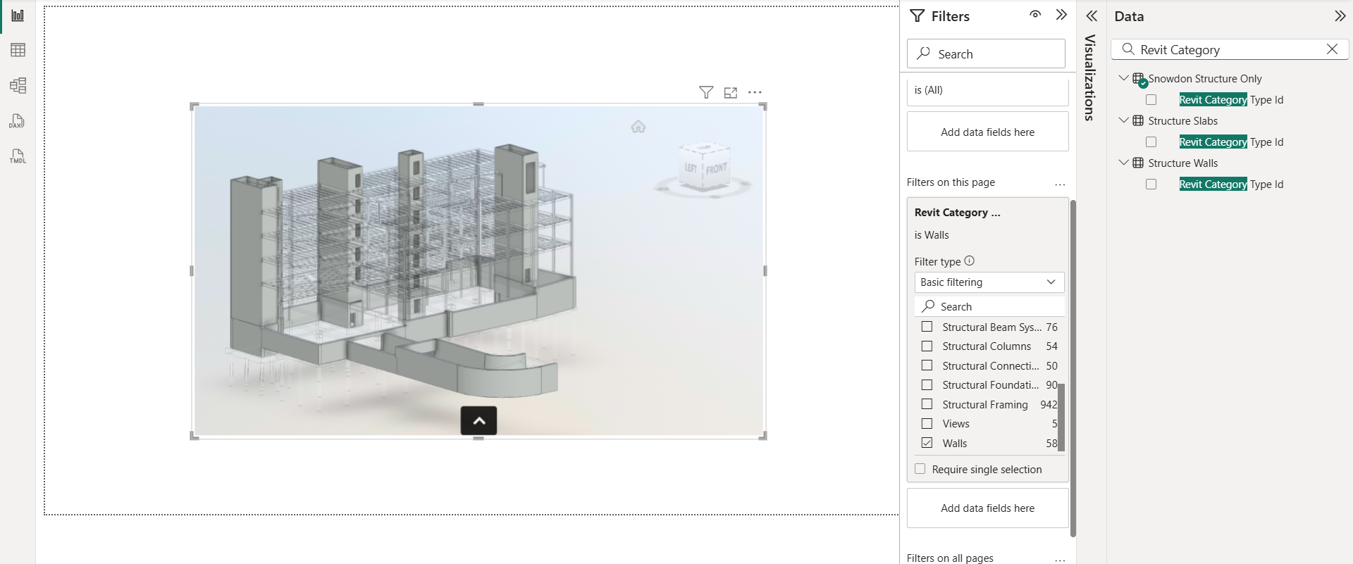
Search for the "data source name.viewer" column in the Data pane.
Drag and drop the "data source name.viewer" column to Viewer field. Note: If passing multiple .viewer columns, a relationship between those tables is mandatory.
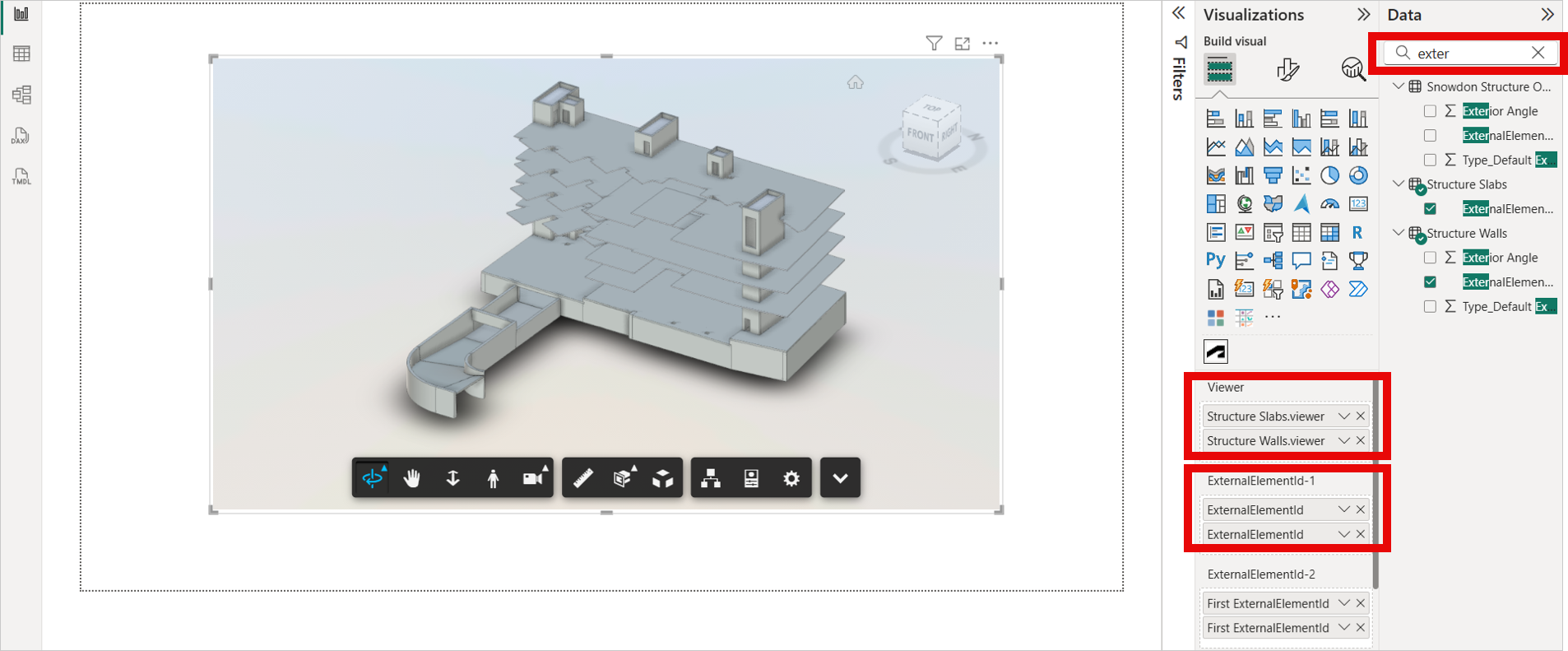
Similarly, Search for the "ExternalElementId" in the Data pane.
Drag and drop the "ExternalElementId" to ExternalElementId-1 and ExternalElementId-2 fields.
Important:- To map elements effectively, ensure that the "ExternalElementId" is used in all fields. If that fails, "Element ID" should be used as a fallback.
- If you pass the viewer data, ExternalElementId-1 and ExternalElementId-2, and then pass the second viewer data, you need to pass the ExternalElementId-1 and ExternalElementId-2; then the model can be visible in the viewer.
The selected model loads in the viewer.
Coloring
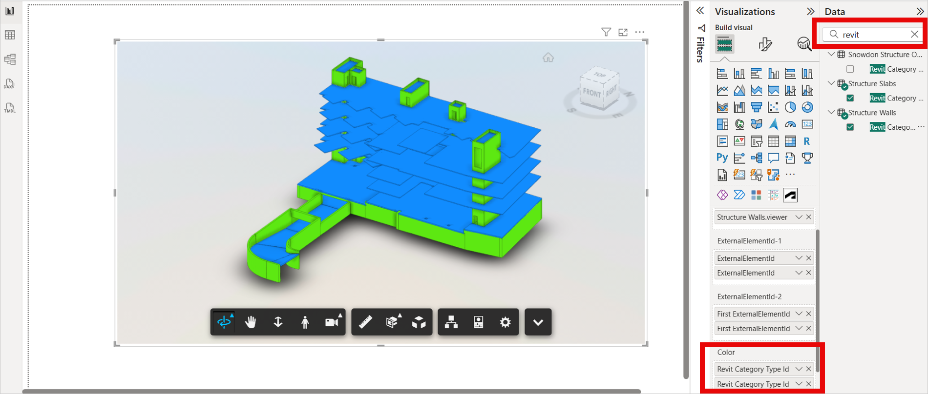
Power BI empowers you to visually differentiate data points using the coloring feature. This intuitive tool allows you to assign distinct colors to objects based on their designated categories, specified in the "Color" field. This color-coding technique effectively categorizes your data, enhancing both visual clarity and information comprehension.
Search for categorical columns such as "Family", "Level", or "Category" in the Data pane.
Drag and drop the categorical column in the Color field. When you add the Color field, the visual assigns random colors to each distinct object.
Navigate to the Format menu in the Visualizations pane and expand Data Colors to assign the specific colors.
Select the required colors for various objects. The chosen color will be applied to all selected objects.
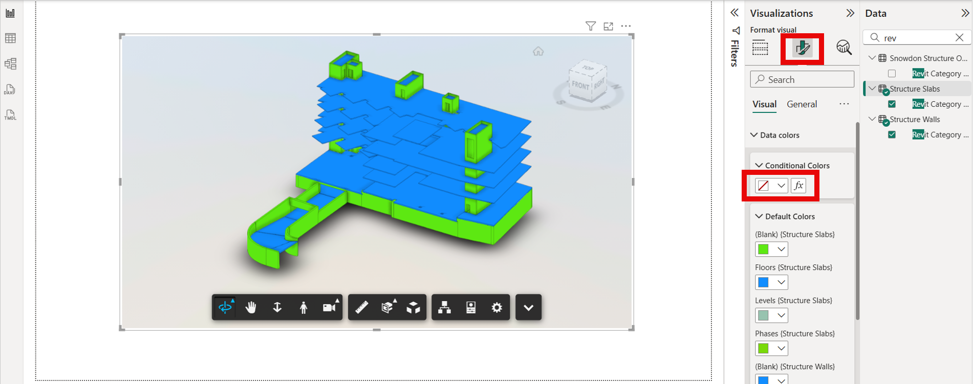
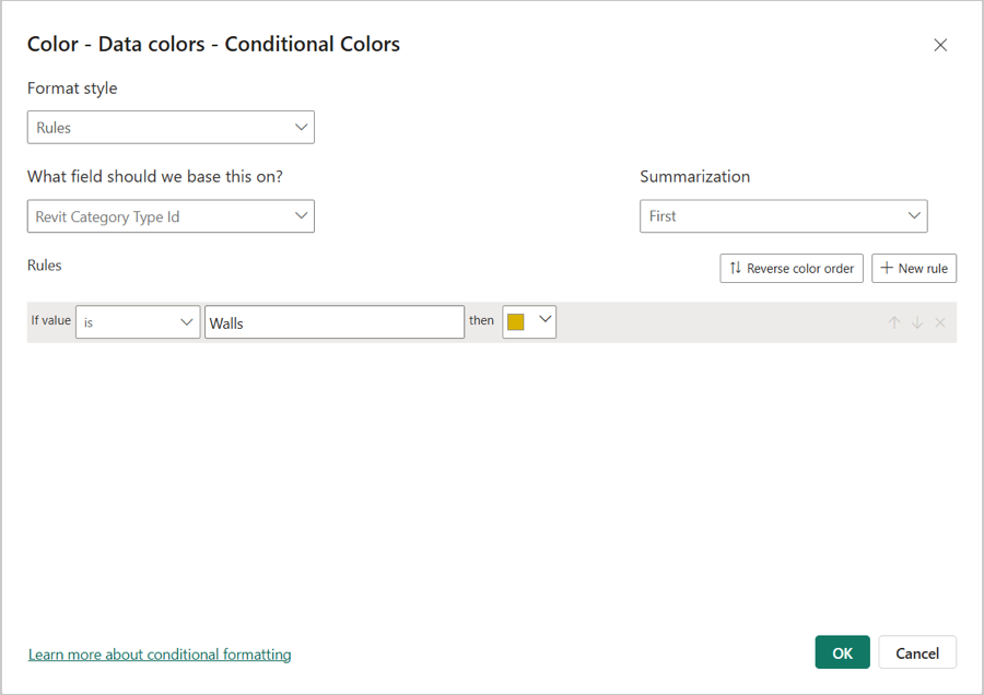
Alternatively, you can apply colors by setting conditions directly in the 'Conditional Colors' section.
Click the 'fx' icon to define the rules based on which colors should be applied to the data.
Note: Please use "fx" option for conditional coloring. Color Picker UI next to the "fx" option is currently disabled.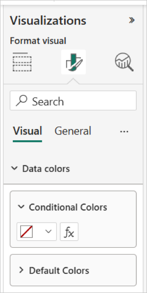
To reset the model to the original view, clear the Color field to remove colors.
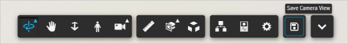
Save Camera View
The Save Camera View feature enhances user experience by allowing users to preserve the current state of the data model viewer. When this option is selected, Power BI captures and stores the viewer's current layout, including:
- The position and zoom level of the model
- The current focus area within the model
This saved state ensures that when users switch between pages or reopen the dashboard, the model view automatically restores to the exact position and configuration they were previously working with. This eliminates the need to manually navigate back to the desired view, improving efficiency and continuity—especially useful during complex model exploration. This button is available on the viewer Toolbar.
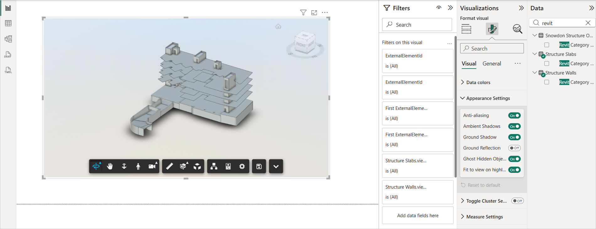
Appearance Settings
The Appearance Settings feature allows users to customize the visual presentation of the data model viewer directly from the Format pane in Power BI, without needing to open the viewer's internal settings menu.
This streamlined access enables users to adjust key visual elements such as:
Anti-aliasing: Smooths jagged edges in visuals for a cleaner look.
Ambient Shadow: Adds subtle shadows to enhance depth and clarity.
Ground Shadow: Projects shadows beneath objects to improve spatial perception.
Ground Reflection: Creates reflective effects on the ground surface for a more polished appearance.
Ghost Hidden Objects - While filtering or slicing, use this setting to make ghosted elements fully opaque, improving the visibility of non‑ghosted elements.
Fit to view on Highlighting - Use this setting if you want to prevent the viewer from fitting the entire model during highlighting, ensuring that only the highlighted element remains in focus.
Key Benefits
- Convenience: Settings are easily accessible from the Format pane, making customization quicker and more intuitive.
- Persistence: Any changes made through the Format pane are saved within the Power BI dashboard file. This means the appearance settings are automatically applied every time the dashboard is reopened, ensuring a consistent viewing experience.
- Control: Users can tailor the visual environment to suit their preferences or presentation needs without navigating away from the main interface.
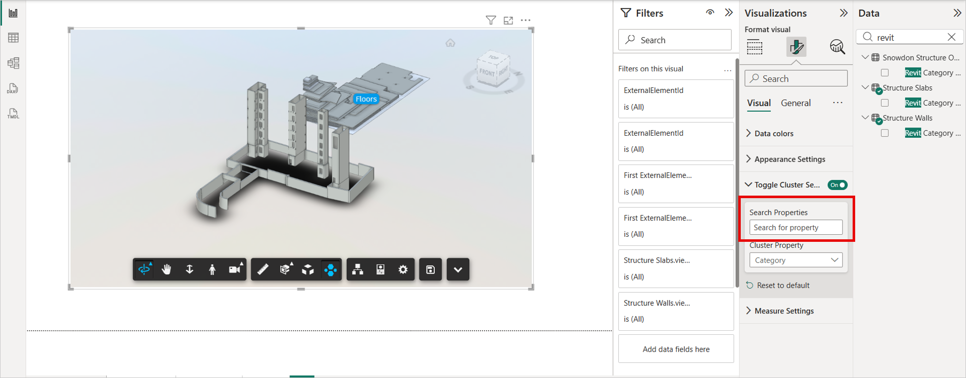
Toggle Cluster Settings
The Toggle Cluster Settings feature enables users to toggle the APS Visual Clusters extension and choose a model property for dynamically generating clustered layouts within the viewer. it is available on the toolbar.
Search for a property or select one from the Cluster Property dropdown.
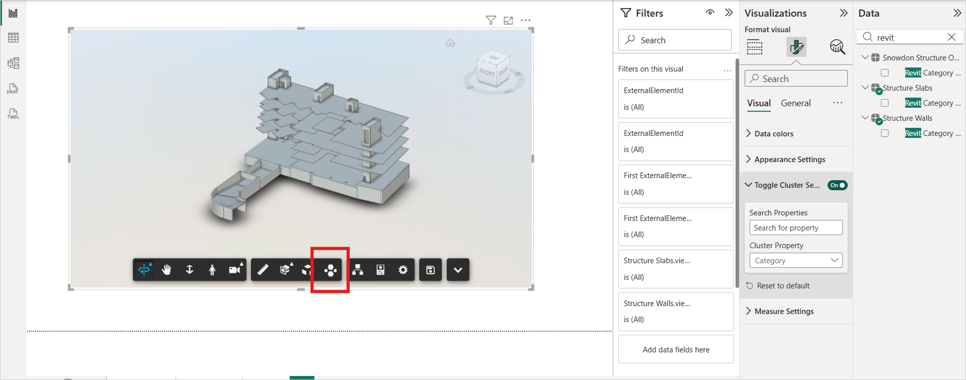
Click the Cluster button in the toolbar to cluster the model based on your selected property.
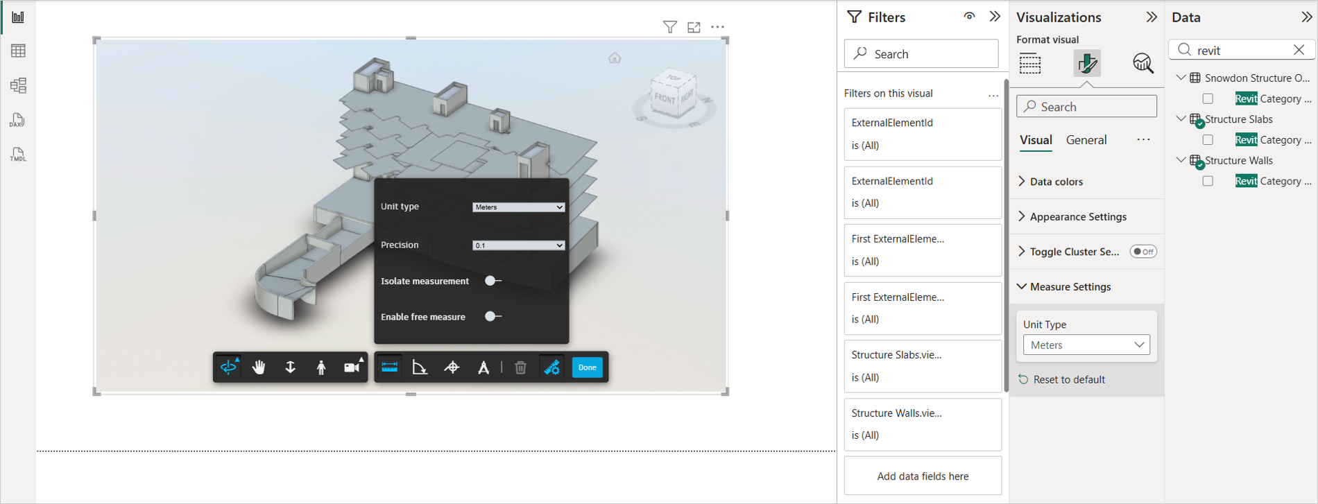
Measure Settings
The Measure Settings feature allows user to persist the measure unit yype from measure tool.
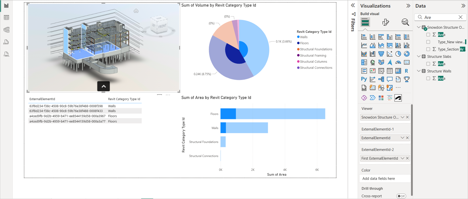
Highlight Objects
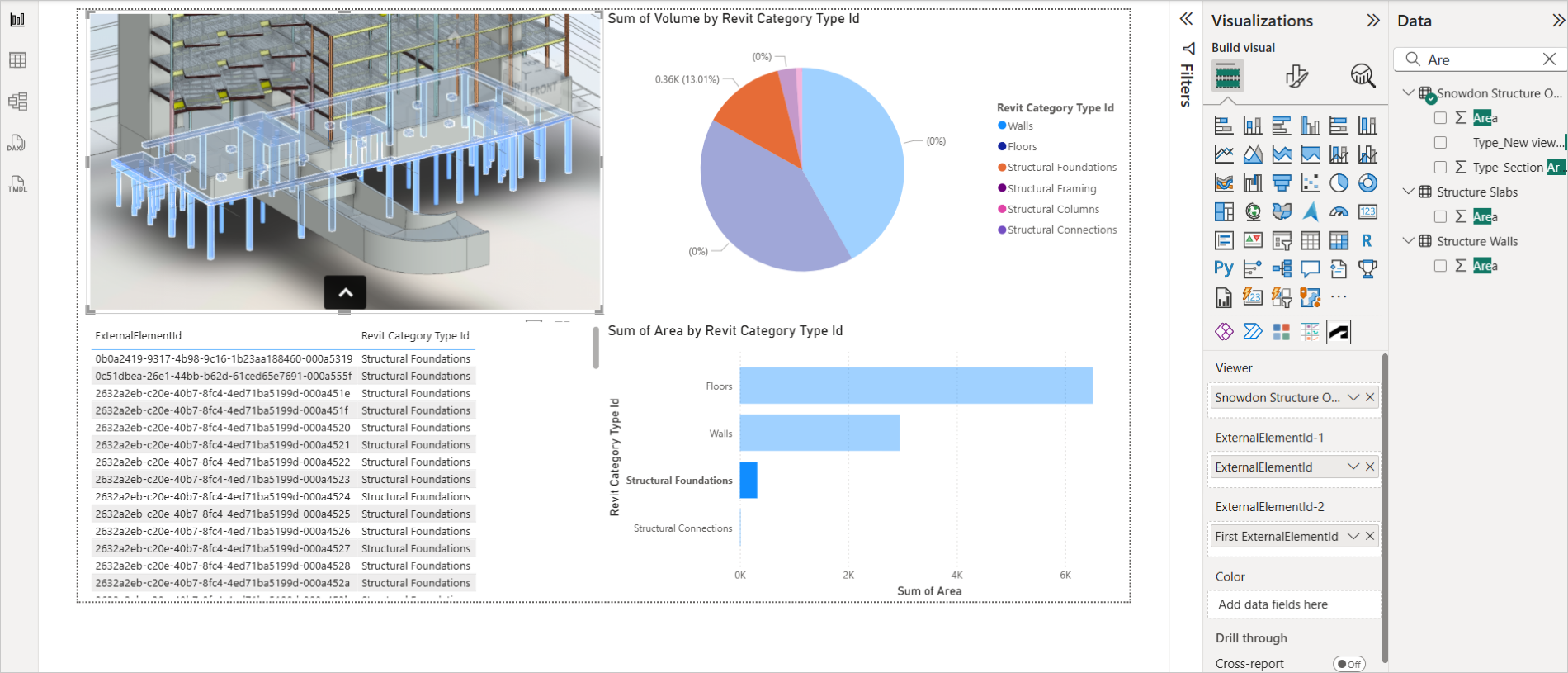
The highlight feature provides a powerful way to isolate and examine specific data points within a visual. When you use this feature, the relevant data point is accentuated, while the remaining data remains visible but subdued. This allows you to focus on specific insights within your data without losing context.
Select the required visual in the Visualizations pane such as Pie chart, Donut chart, Bar chart, and so on. You can select multiple visuals.
Search the required categorical columns in the Data pane.
Drag and drop the categorical column to the respective fields in the Visualizations pane.
Select an object from another visual. It highlights and separates the object in viewer as shown in the following image.
Select an object from viewer. It highlights and separates the object in other visuals.
Select a group of objects from a visual. It highlights and separates the objects in viewer, and filters them out in other visuals.
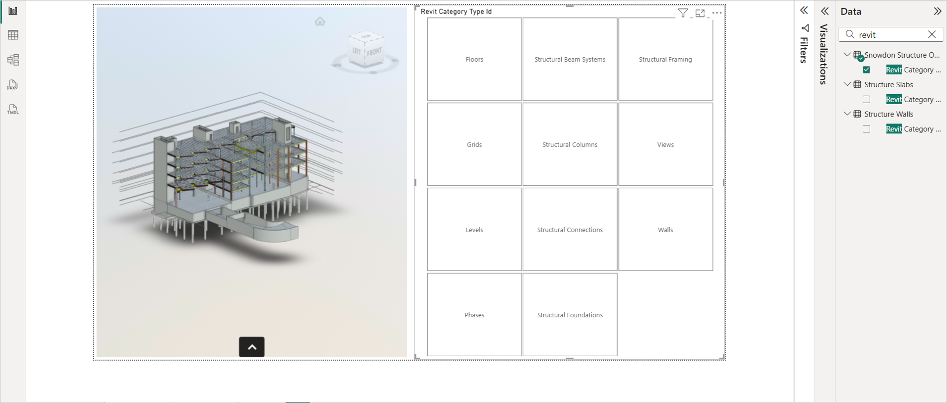
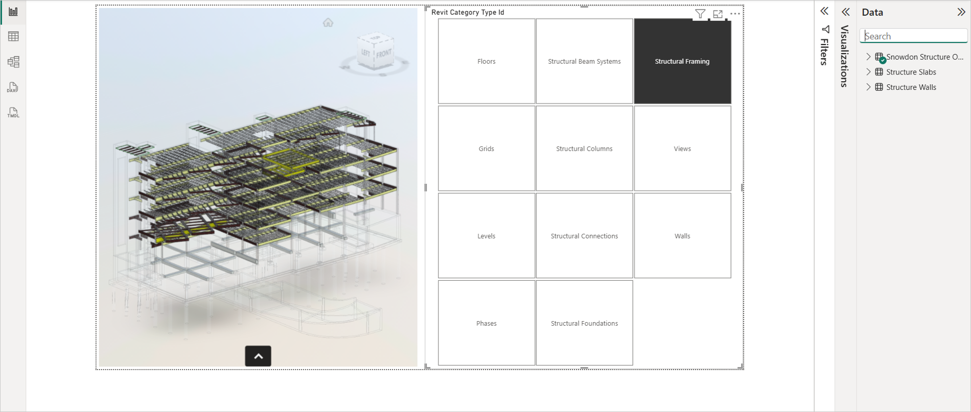
Isolate or Ghosting
A feature that makes selected nodes in a model transparent, allowing other nodes to become more prominent. This feature is very useful to isolate specific objects from the entire model. With this feature, you can use "Slicers" and "Filters" to Filter out elements from viewer.
Select the Slicer visual from the Visualizations pane.
Search for categorical columns such as "Family", "Level", or "Category" in the Data pane.
Drag and drop the categorical column to the respective field in the Visualizations pane to create a Slicer.
Select the required category. It isolates the selected elements as shown in the following image.
For Filters, use any categorical column such as "Family", "Level", or "Category". It applies the filter on the viewer.
To reset the model to the original view, clear any active filter or slicer.
Tool Tip
The Tool Tip feature provides contextual information about elements within the viewer when the user hovers the mouse over them. This helps users quickly understand the data or object they are interacting.
- The information displayed in the tooltip is based on the value provided in the Color field of the model.
- If no value is assigned to the color field, the viewer will not display any tooltip.
- The tooltip appears in the top-left corner of the viewer interface, ensuring it doesn’t obstruct the view of the model. This feature enhances interactivity and improves the user experience by offering immediate insights without requiring additional clicks or navigation.
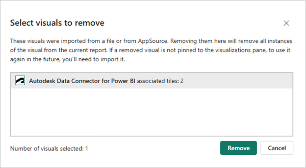
Removing a Visual from Power BI
Open Power BI Desktop software.
Click the More (...) menu in the Visualizations pane.
Click Remove a visual from the drop-down list.
Select Autodesk Data Connector and click Remove. It removes the visual from viewer.